In 2026, Webflow has become the leading platform for building fast, scalable, and visually rich websites without traditional development overhead.
From SaaS startups to global agencies, brands are using Webflow to create experiences that are not just visually impressive but also highly optimized for performance and conversions.
But before building your next project, studying real-world examples and Webflow website inspiration can help you understand what actually works in modern web design. The difference between a good website and a great one often comes down to subtle design decisions, UX patterns, and conversion strategies.
In this article, we explore 10 of the best Webflow websites in 2026—breaking down their design approach, UX decisions, and key takeaways you can apply immediately to your own projects.
Whether you’re planning a SaaS platform, agency portfolio, or ecommerce store, these examples will show you what’s possible when creativity meets no-code power.
Why Webflow Is the Go-To Platform in 2026
The Rise of Webflow in Modern Web Design
Webflow’s growth isn’t accidental. The platform has evolved into the preferred choice for professionals who want design freedom without sacrificing technical control.
Here’s why brands are choosing Webflow:
- No-code meets developer-level control: Designers can build visually while still accessing clean, semantic code and custom integrations
- Faster build and iteration cycles: What used to take weeks in traditional development now takes days
- Built-in performance & SEO: Clean code generation, automatic asset optimization, and comprehensive SEO controls out of the box
- Advanced animations & interactions: Native support for complex animations and scroll-based storytelling without heavy JavaScript
- Growing enterprise adoption: SaaS companies, fintech startups, and B2B brands are migrating to Webflow for scalability and performance
The platform has shifted from being a tool for designers to a complete web development solution trusted by serious businesses.
What Makes a Webflow Website Truly Great?
Not all websites built on Webflow are created equal. The best ones share four core characteristics that separate them from template-based builds.
Design & UX Quality
Great websites prioritize user experience over decoration:
- Clean layouts with strong visual hierarchy guide users naturally through content
- Thoughtful typography systems create readability and brand personality
- Intuitive user flows minimize friction and make navigation effortless
The best design inspiration comes from sites that balance creativity with usability.
Performance & SEO
Fast-loading sites rank better and convert higher:
- Optimized images and assets reduce page weight without sacrificing quality
- Clean semantic structure helps search engines understand and rank content
- Core Web Vitals optimization ensures smooth performance across all devices
Performance isn’t just about speed—it’s about user experience and search visibility.
Interaction & Experience
Modern websites use motion to enhance storytelling:
- Smooth, purposeful animations guide attention without overwhelming users
- Micro-interactions provide feedback and delight
- Scroll-based storytelling creates immersive, narrative-driven experiences
The best sites use motion sparingly and intentionally to support the user journey.
Conversion Focus
High-converting sites are built around clear business goals:
- Strategic CTA placement guides users toward desired actions
- Landing page optimization removes distractions and focuses on conversion
- Minimal friction user journeys make it easy to take the next step
Every design element should serve a purpose tied to user goals or business objectives.
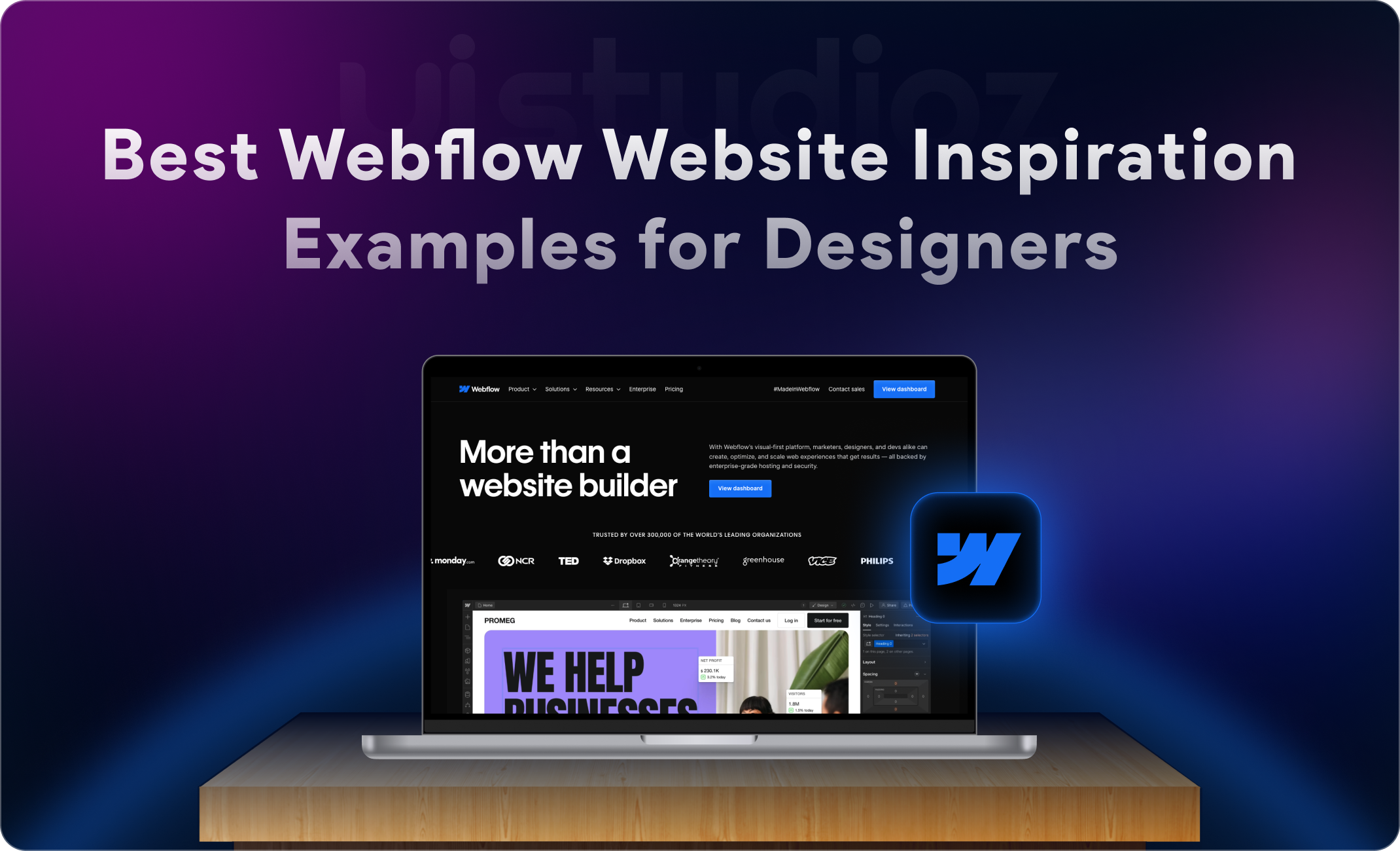
10 Best Webflow Websites to Inspire Your Next Project in 2026
Now let’s explore the top examples that exemplify excellence in design, UX, and conversion optimization.
Website #1 – Uistudioz
What it is: A specialized Webflow development agency offering design, development, and white-label services for startups and agencies.
Industry/Type: Webflow Agency
Why it stands out:
- Clean, conversion-focused layout that demonstrates agency expertise
- Clear service architecture makes it easy to understand capabilities
- Portfolio presentation that showcases real client results
Key Takeaways
- Minimal design with strategic white space improves clarity and reduces cognitive load
- Service categorization (development, design, Maintenance, Migration, SEO) creates intuitive navigation
- Subtle scroll animations enhance engagement without distracting from content
This demonstrates how specialized agencies can position themselves through thoughtful information architecture and clean visual design. Visit Uistudioz to see the full implementation.
Website #2 – Jasper
What it is: An AI-powered content creation platform helping marketers and creators scale their content production.
Industry/Type: SaaS / AI Platform
Why it stands out:
- Masterclass in conversion-focused SaaS design
- Bold headlines paired with benefit-driven copy
- Clear product story that moves visitors from awareness to trial
Key Takeaways
- Bold, confident brand identity with strong typography and generous spacing
- Clear product positioning with strategic social proof placement
- Dynamic feature demonstrations show (not just tell) what the product does through scroll-triggered reveals
Website #3 – Clay
What it is: A relationship management platform that helps professionals stay connected with their network.
Industry/Type: SaaS / Productivity Tool
Why it stands out:
- Playful animations and warm brand personality
- Differentiates itself in a crowded CRM market
- Product storytelling through interactive demos
Key Takeaways
- Friendly, approachable design with organic shapes and soft color palettes
- Clear use case segmentation helps visitors understand relevant applications
- Scroll-based product demonstrations let users “experience” the product before signing up
Website #4 – Fourmula AI
What it is: An intelligent automation platform designed for finance and operations teams.
Industry/Type: Fintech SaaS
Why it stands out:
- Demonstrates how complex B2B products can be explained simply
- Clean design paired with clear messaging
- Strategic use of diagrams to communicate value
Key Takeaways
- Corporate professionalism meets modern minimalism
- Clear value proposition hierarchy with benefit-focused sections
- Animated data visualizations communicate product capabilities without overwhelming technical details
Website #5 – Typeform
What it is: A survey and form-building platform known for its conversational user experience.
Industry/Type: SaaS / Data Collection Platform
Why it stands out:
- The entire site feels like a conversation
- Playful interactions and progressive disclosure keep users engaged
- Practices what it preaches through user-centric design
Key Takeaways
- Conversational, interactive design with bold typography and vibrant colors
- Storytelling through interactive demos creates memorable brand experience
- Embedded product demos let visitors experience the unique UX directly on the marketing site
Website #6 – Tavus
What it is: An AI video personalization platform that creates customized videos at scale.
Industry/Type: AI SaaS / Video Technology
Why it stands out:
- Video-first design showcases the product in action
- Visitors immediately see what makes the platform unique
- Product demonstration is prioritized over lengthy explanations
Key Takeaways
- Clean, video-focused layout with minimal distractions
- Product demonstration front and center with clear use case examples
- Auto-playing personalized video examples demonstrate product value within seconds of landing
Website #7 – The Furrow
What it is: A creative agency specializing in brand strategy and design.
Industry/Type: Creative Agency
Why it stands out:
- Pure visual storytelling through bold layouts
- Unexpected transitions create memorable experience
- Portfolio showcased as the hero of the site
Key Takeaways
- Bold, portfolio-first design with large imagery and brave typography choices
- Work categorization helps visitors find relevant examples quickly
- Immersive project previews with scroll-triggered reveals build anticipation
Website #8 – Superlist
What it is: A collaborative productivity platform combining tasks, notes, and team coordination.
Industry/Type: SaaS / Productivity Platform
Why it stands out:
- Bento grid layouts and soft gradients create modern feel
- Approachable design for a productivity tool
- Feature clarity without overwhelming information
Key Takeaways
- Modern, grid-based layouts with gradient accents and glassmorphism effects
- Clear feature presentation with team vs. individual use case separation
- Interactive feature grid lets users explore capabilities without leaving the homepage
Website #9 – Faircraft
What it is: A sustainable materials company creating lab-grown leather alternatives.
Industry/Type: B2B / Sustainable Technology
Why it stands out:
- Balances scientific credibility with emotional storytelling
- Beautiful imagery paired with clear messaging
- Explains complex innovation through design
Key Takeaways
- Clean, editorial-style layouts with beautiful product photography
- Educational content architecture with clear impact messaging
- Scroll-driven story progression educates visitors about technology and mission
Website #10 – Simonholm.studio
What it is: A personal portfolio showcasing digital design and development work.
Industry/Type: Personal Portfolio / Freelancer
Why it stands out:
- Demonstrates how freelancers can stand out through experimental design
- Unique navigation and personality-driven approach
- Technical skill showcased through the site itself
Key Takeaways
- Experimental, typography-heavy design with unconventional navigation
- Clear project presentation combined with strong personal brand
- Custom cursor interactions and layout-breaking design choices showcase technical capability
Webflow Design Trends You’ll See in 2026
Studying leading examples reveals several emerging patterns shaping modern web design.
Emerging Trends
AI-driven personalization: Websites are beginning to adapt content and layouts based on user behavior, creating unique experiences for different visitor segments.
Bento grid layouts: Inspired by modern design systems, these grids organize content into clean, modular cards that work beautifully across devices.
Brutalist + minimalist fusion: Raw, honest design elements combined with clean layouts create sites that feel both human and refined.
3D interactive elements: Lightweight 3D graphics add depth without sacrificing performance.
Motion storytelling: Scroll-based narratives using advanced animations create immersive experiences that keep visitors engaged.
Dark mode-first design systems: More brands are designing for dark mode as the primary experience, reflecting user preferences and modern OS defaults.
These trends show a shift toward experience-driven design rather than template-based approaches.
Industry-Wise Inspiration Breakdown
Different industries require different approaches. Here’s how leading examples vary by use case:
SaaS Websites
Conversion-focused layouts: Sites prioritize clear value propositions, feature explanations, and frictionless trial signups—examples: Jasper, Clay, Typeform.
Product storytelling pages: The best examples show what the product does through interactive demos and scroll-based reveals rather than static descriptions.
Agency Websites
Portfolio-heavy designs: Agency sites lead with work examples and case studies—see The Furrow’s bold portfolio presentation.
Bold visual identity: Design itself becomes proof of capability—the site serves as the first case study.
Ecommerce Websites
Product-first UX: Sites prioritize product photography, fast checkout flows, and mobile-optimized browsing.
High-conversion landing pages: The best ecommerce sites reduce friction between discovery and purchase through strategic layout and clear CTAs.
Startup Websites
Fast, minimal, investor-focused design: Sites communicate vision quickly and clearly—essential for early-stage companies pitching to investors and early adopters.
Personal Portfolios
Experimental layouts: Individual designers and developers often use their sites as creative playgrounds—like Simonholm.studio.
Interactive storytelling: The best portfolios create memorable experiences through unique navigation and personality-driven design choices.
Common Mistakes in Webflow Websites
Even with powerful tools, designers make avoidable mistakes. Here’s what to avoid:
Overuse of animations: While animations are easy to add, too much motion creates cognitive overload. Use animation purposefully, not decoratively.
Poor mobile optimization: Designing desktop-first leads to awkward mobile experiences. Always design mobile-first and enhance for larger screens.
Weak CTA hierarchy: When every button is bright and bold, nothing stands out. Create clear visual hierarchy that guides users toward primary actions.
Slow performance due to heavy assets: Unoptimized images and videos kill performance. Always compress assets and use responsive image features.
Overdesigned layouts with low clarity: Beautiful doesn’t always mean effective. Prioritize clarity over decoration.
Ignoring SEO structure: Tools are useless if you don’t use proper heading hierarchy, meta descriptions, and semantic HTML.
These mistakes are common but entirely preventable with proper planning and testing.
How to Build a High-Converting Webflow Website
Learning from examples is just the first step. Here’s how to apply these insights to your own projects:
Start with wireframes before design: Plan your user journey and conversion paths before building. The best sites are built on solid information architecture.
Use CMS properly for scalability: If you’re building a blog, portfolio, or product catalog, leverage the CMS from the start for easier content management.
Keep UI simple but intentional: Every design element should serve a purpose. Remove anything that doesn’t support user goals or business objectives.
Optimize for Core Web Vitals: Performance impacts both rankings and user experience. Build fast from day one.
Design mobile-first: With most traffic coming from mobile devices, your mobile experience should be primary, not an afterthought.
Build with conversion paths in mind: Map out how visitors move from landing to conversion, and remove friction at every step.
If you’re looking for expert help, consider working with a specialized Webflow development agency that understands both design and conversion optimization.
Final Thoughts: Webflow Website Inspiration for Modern Brands
The 10 examples featured in this article represent what’s possible when creative webflow design meets no-code flexibility. From SaaS platforms like Jasper and Clay to agency showcases like The Furrow and Uistudioz, and personal portfolios like Simonholm.studio, these sites prove that Webflow enables modern web experiences that perform. What separates them from average builds isn’t just visual polish—it’s the strategic thinking behind every design decision. Each demonstrates how design, performance, and conversion optimization work together to create experiences that serve both user needs and business goals.
As you plan your next Webflow project, remember that inspiration should inform your decisions, not dictate them. Use these examples to understand what’s possible, identify patterns that work for your industry, and learn from the UX decisions that create seamless user journeys. Whether you’re focusing on Webflow SEO strategies or building high-performing Webflow for SaaS websites, the goal should always be to align design with business outcomes. But ultimately, your site should be built around your unique value proposition, audience needs, and business objectives. The fundamentals remain the same: start with user needs, prioritize clarity over decoration, optimize for performance, and design with conversion in mind. Ready to start building? Explore professional Webflow services or get in touch to discuss how we can help bring your vision to life.
Frequently Asked Questions
Is Webflow good for professional websites in 2026?
Yes. Webflow is widely used by startups, SaaS companies, and agencies because it combines design flexibility with strong performance and scalability. Many Fortune 500 companies and leading tech brands now use Webflow for their marketing sites.
Can Webflow handle large-scale websites?
Absolutely. The CMS can manage thousands of pages, and the hosting infrastructure (built on AWS and Fastly) handles enterprise-level traffic. Many sites featured in this article serve millions of visitors monthly without performance issues.
Is Webflow better than WordPress for design?
For design control and modern UX, Webflow gives designers pixel-perfect control without needing to code or rely on page builders. WordPress is more flexible for complex custom functionality, but for design-driven sites, Webflow often provides a better balance of power and usability.
Do Webflow websites rank on Google?
Yes, when properly optimized. Webflow generates clean, semantic HTML and provides comprehensive SEO controls. Many examples rank competitively for challenging keywords because the platform’s technical foundation supports good SEO practices.
How much does a Webflow website cost?
Costs vary based on complexity. Simple sites can be built for a few thousand dollars, while custom enterprise projects may cost $20,000-$100,000+. The investment typically depends on design complexity, custom functionality, and integration requirements.
Where can I find more Webflow inspiration?
Beyond this list, explore the official Webflow showcase, browse sites like Awwwards and Site Inspire, and study examples featured in design communities. Many agencies also maintain inspiration galleries showcasing their best work.
What’s the difference between Webflow and Framer for design?
Both platforms excel at different things. Webflow offers more robust CMS capabilities and hosting infrastructure, making it better for content-heavy sites and client work. Framer is newer with excellent component-based design and is popular for interactive prototypes and modern landing pages. Choose based on project requirements: Webflow for scalability, Framer for rapid prototyping.
How do I ensure my website converts visitors?
Study high-performing examples and apply these principles: clear value proposition above the fold, strong visual hierarchy guiding attention to CTAs, social proof and trust signals, mobile-optimized experience, and fast load times. Prioritize user journey over decoration.