
Most websites look the same in 2026. Same fonts, same hero layout, same fade-in animation. Visitors notice this faster than brands do, and they leave faster too.
That is the real story behind webflow design trends this year. The tools have gotten more powerful, so the baseline quality has gone up everywhere. Standing out now takes intention, not just a new template. This guide walks through what is actually changing in Webflow design, which fonts perform well in 2026, and how to apply these trends to a real website without slowing it down.
What Are Webflow Design Trends
Webflow design trends are the recurring patterns in layout, typography, motion, and interaction that designers use on sites built with Webflow. They are shaped by three forces: what Webflow’s visual canvas makes possible, what users expect after seeing thousands of websites, and what actually moves a conversion metric.
Tracking webflow design trends matters because they shift fast, and a site built on last year’s pattern can start to feel dated within months. Not every trend deserves a place on your site. A trend earns its spot only if it helps a visitor understand your product faster or trust your brand more. Glassmorphism on a pricing card might look good. Glassmorphism that hides your CTA button does not.
Evolution of Web Design Trends
Web design has moved through clear phases. Flat design replaced skeuomorphism around 2013. Then came bold gradients and 3D illustration. Around 2020, minimalism returned as a response to cluttered, slow-loading sites.
2025 was a year of experimentation. Designers tested oversized type, brutalist layouts, and heavy 3D visuals to see what users would tolerate. Heading into 2026, the industry is settling those experiments into standards. Bold typography stays. Unnecessary motion gets cut. Speed and clarity win over decoration.
Webflow has tracked this same shift. Its own 2026 trend report frames the moment as designers figuring out how to stand out when the baseline is higher and attention is scarcer. That single idea explains almost every modern webflow ui design trend on this list.
Why Webflow Leads Trends
Webflow sits in a unique spot. It gives designers full visual control over CSS, while still producing clean, semantic code in the background. That combination is why so many of the trends below started on Webflow sites before spreading elsewhere.
A few reasons Webflow stays ahead on modern web design trends webflow teams actually ship:
- Native Interactions let you build scroll-based and hover-based motion without writing JavaScript.
- CSS Grid support makes complex layouts like bento grids achievable visually, not just in code.
- Built-in CMS and clean markup mean design changes do not break SEO structure.
- Variable font support lets a single file carry every weight a brand needs.
If you are weighing why use webflow for website design against a traditional stack, this control without a developer bottleneck is usually the deciding factor. Teams comparing platforms in depth can read our breakdown on Webflow development for a wider view of where no-code build quality stands today.
Top Design Trends
Here are the modern webflow design trends shaping sites this year, based on what is actually ranking, converting, and getting cloned across the Webflow community.
Proprietary visual systems. As design tools become more accessible to everyone, visual sameness becomes the real risk. Brands are investing in custom filters, signature animations, and brand-specific effects that scale across the whole site instead of relying on generic templates.
Bento grid layouts. Inspired by Apple’s product pages, bento grids break a section into asymmetric cards of different sizes. They remain one of the most cloned patterns in the Webflow community because they let you give visual weight to the most important card in a feature list or pricing comparison.
Dark mode as a full system. A dark mode toggle is not enough anymore. Roughly a third of users prefer browsing in dark mode, and that share is even higher among tech-savvy audiences, so brands now design a complete dark palette with its own contrast rules instead of just inverting the light theme.
Dynamic text treatments. Text that shifts weight, reveals letter by letter, or reacts to scroll and hover. This only works well in Webflow’s native Interactions panel when the animation does not block reading.
Minimalist, brevity-first copy. Pages are cutting word count aggressively in favor of short, scannable statements — a direct response to shrinking attention spans and the rise of TL;DR-style page summaries.
Guided scroll navigation. Progress bars and scroll indicators that tell a visitor how much content remains. This directly addresses declining attention spans on long pages.
Micro-interactions. Small, responsive details — a button that shifts on hover, an icon that animates on click — that make a page feel alive without adding load time.
Real Webflow Examples
Looking at some of the best Webflow websites live today makes these trends concrete. Several SaaS and creative agency sites built on Webflow currently combine bento-style feature grids with kinetic headline type, using the platform’s native CMS to keep both fast and editable. Webflow’s own Made in Webflow showcase is a useful, free reference if you want to see current community work before briefing a designer — it updates constantly with sites built using these exact patterns. We have covered how this no-code shift is changing delivery timelines in our earlier piece on the future of no-code web development with Webflow.
The common thread across the strongest examples is restraint. One signature animation, one bold type choice, one distinctive layout pattern — not five trends stacked on a single homepage.
Typography Trends
Typography is no longer a background decision. It has become a primary brand signal, on par with logo and color palette.
The biggest shift in 2026 is the move away from default, safe fonts. For years, sites defaulted to neutral choices because they were available everywhere. Now, brands treat type as a primary visual identity tool with oversized headlines, custom typefaces, and text that responds to user interaction.
Variable fonts are the technical reason this is possible at scale. A single variable font file can hold every weight from thin to black, which removes the page-weight penalty that used to come from loading four or five separate font files. That matters directly for webflow typography trends 2026, since Google’s own web performance team notes that delayed font loading is a direct cause of slower First Contentful Paint and Largest Contentful Paint scores, which in turn affects search visibility. Sites unsure where they currently stand can start with our Webflow SEO services to audit these performance signals.
Legibility research backs this up too. Nielsen Norman Group’s content usability guidelines note that legibility — driven largely by font size, contrast, and avoiding overly stylized typefaces — is the baseline requirement before readability or comprehension even matter, confirming that font choice affects far more than aesthetics.
Three sub-trends worth tracking inside typography:
- Oversized display headlines that act as a hero visual on their own, without a supporting image.
- Variable-weight body text that shifts subtly on scroll or hover for emphasis.
- Editorial serif accents paired with a clean sans-serif body, borrowed from print design to add warmth.
Design System Thinking
Picking a font or a layout pattern in isolation is not enough. The sites that hold up over time treat design as a system: a defined type scale, a fixed color palette, consistent spacing tokens, and reusable components.
In Webflow, this means building out class-based components — buttons, cards, navigation — once, then reusing them across every page through the CMS. This is also what allows a site to adopt a new design trend, like a bento grid,without rebuilding the whole page from scratch. It’s this systemic approach that separates the best Webflow websites from ones that need a redesign every year.
This system-first approach is exactly what separates a site that ages well from one that needs a full redesign within a year. If your current site was built without a documented system, a Webflow design audit before adding new trends usually pays for itself in saved rework later. Agencies managing this across multiple client sites often lean on white-label Webflow development to keep design systems consistent without growing an in-house team.
Font Pairing
Choosing one good font is easy. Pairing two that work together takes more care. The safest, most tested approach for 2026 still follows three rules: limit yourself to two or three families, create contrast between heading and body type, and confirm both fonts share a similar x-height so they sit well together visually.
A few pairings that consistently perform well on modern Webflow sites:
| Use Case | Heading Font | Body Font | Why It Works |
| B2B SaaS | Syne | Inter | Bold, distinctive headline against a neutral, highly readable body |
| Startup landing page | Plus Jakarta Sans | Inter | Expressive but professional, fast-loading pair |
| Editorial / agency | Playfair Display | DM Sans | Serif warmth balanced by a clean geometric body |
| Fintech | DM Serif Display | Plus Jakarta Sans | Trust signal from serif, modern feel from sans-serif |
For the question of best google fonts for webflow landing pages, Inter, Plus Jakarta Sans, and DM Sans remain the most reliable free options because they are optimized for screen rendering and load instantly through Webflow’s native Google Fonts integration. All are free, open-source, and carry no licensing risk for commercial projects.
Trending Font Families for Webflow in 2026
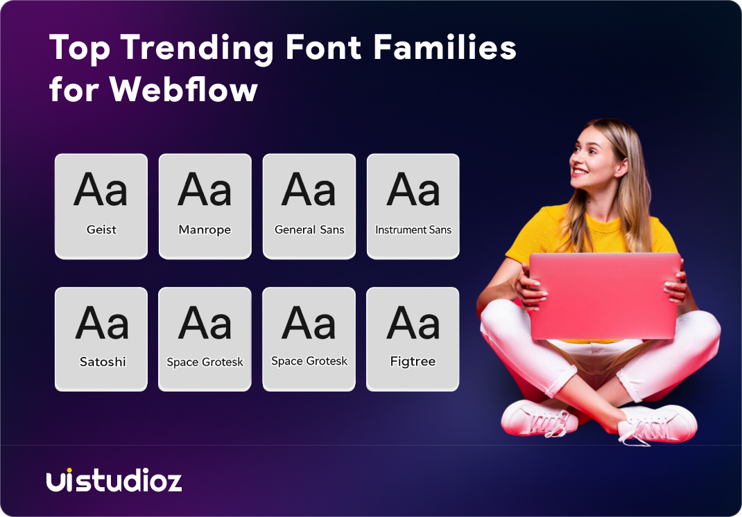
The following table lists font families gaining traction on Webflow sites in 2026, beyond the standard heading-body pairings covered above.
| Font | Best For | Why It’s Trending |
| Geist | Developer tools, dashboards, technical products | Built by Vercel specifically for developer-facing interfaces, with a matching monospace companion for code |
| Manrope | UI-heavy sites, pricing tables, data dashboards | Uses aligned numeral height, so numbers in tables and stats don’t sit unevenly |
| General Sans | Editorial sites, personal portfolios | Humanist curves give it a warmer feel than standard grotesque sans-serifs |
| Instrument Sans | AI product sites, Framer-style layouts | Wide letterforms and tight spacing, widely used in Framer’s own branding |
| Satoshi | Creative agencies, brand-led landing pages | Geometric structure with distinct character, built for both headlines and body text |
| Space Grotesk | Tech and SaaS headlines | Retains monospace-inspired detailing while staying readable at display sizes |
| Figtree | Startup and consumer product sites | Curved letterforms (y, f, t) give it a casual, approachable tone |
Conversion Psychology
Design trends only matter if they move a business metric. A few psychological principles explain why specific trends on this list actually convert, not just look good.
Visual hierarchy reduces decision fatigue. Bento grids work because they tell a visitor’s eye where to look first, instead of presenting ten equal-weight options.
Motion signals responsiveness. A button that reacts to a hover reassures a visitor that the interface is working correctly, which builds small, cumulative trust before they ever submit a form.
Familiar type builds credibility faster than novelty. Research on AI-driven traffic conversion shows visitors convert noticeably better when a page loads instantly and reads clearly, since AI-driven website traffic now converts at 14.2% compared to just 2.8% from traditional search traffic — a gap largely explained by speed and clarity, not visual novelty.
This is the real argument for restraint: every trend should reduce friction, not add visual noise that a visitor has to process before they can act. Teams that want these principles applied systematically across an entire site can look into our Webflow CRO services.
Landing Page Trends
Landing pages carry the highest stakes of any page on a Webflow site, since this is usually where a visitor decides to convert or leave. A few patterns are consistently behind the best webflow landing page design examples in 2026:
- A single, oversized headline above the fold, with no competing visual element.
- One primary CTA repeated at most three times, never more.
- Social proof (logos, a short testimonial, or a usage stat) placed within the first scroll.
- A bento-style feature grid replacing the traditional three-column icon list.
- Dark mode as an option, not forced, with a toggle visible in the header.
For SaaS teams specifically, this combination tends to outperform the older “hero image plus feature list” template that dominated the last several years. Agencies building these systems at scale, including white-label partners, can review our dedicated guide on Webflow for SaaS for layout patterns built specifically around this conversion path.
Mistakes and Best Practices
| Common Mistake | Why It Hurts | Better Practice |
| Loading 4+ font weights “just in case” | Slows page load, hurts Core Web Vitals | Use a variable font with only the weights you actually use |
| Stacking five trends on one homepage | Confuses visual hierarchy, dilutes brand | Pick one signature trend and execute it well |
| Animating every element on scroll | Distracts from the CTA, hurts mobile performance | Reserve motion for 2–3 high-impact moments per page |
| Choosing fonts before defining a type scale | Inconsistent sizing across pages | Build the type scale first, then select fonts to fit it |
| Ignoring dark mode contrast ratios | Fails accessibility, looks unfinished | Test contrast against WCAG AA on both light and dark palettes |
| Copying a trend without testing on mobile | Many scroll and kinetic effects break on smaller screens | Preview every interaction on mobile breakpoints before publishing |
Tools and Resources
A short list of tools worth knowing if you are implementing these trends directly in Webflow:
- Webflow Interactions — native panel for scroll, hover, and click-based animation, no code required.
- Google Fonts — free, web-optimized font library integrated directly into Webflow’s typography settings.
- W3C Web Content Accessibility Guidelines (WCAG) — the official accessibility standard to test your color and dark mode contrast choices against.
- Made in Webflow — Webflow’s own community showcase for current, real design inspiration.
- PageSpeed Insights — Google’s free tool to confirm new fonts and animations have not hurt Core Web Vitals.
Teams converting designs from Figma into a live Webflow build can also see how this typography and component work translates directly through our Figma to Webflow service, and teams managing ongoing updates after launch can review our Webflow maintenance services.
Future of Webflow Design
A few directions look set to define the next year of webflow website design trends. AI-assisted layout suggestions are becoming a genuine starting point for designers, not just a novelty, cutting early prototyping time significantly. Optimizing for AI-driven search is also becoming a design priority, not just a content one — as AI Overviews and answer engines summarize pages directly, clear structure, scannable headings, and fast load times are what let a page get cited in the first place. Accessibility is shifting from an afterthought to a default requirement, partly because Google continues to reward sites that meet WCAG standards with better visibility. And performance is becoming a design constraint, not just a developer concern — designers are now expected to choose lighter fonts and fewer animations specifically to protect Core Web Vitals scores.
The sites that will still look current in 2027 are the ones built on a strong system today, not the ones chasing every visual trend as it appears.
Conclusion
Staying current with webflow design trends is less about chasing every new pattern and more about discipline. The sites that actually win are not the ones using the most trends. They are the ones that pick a small set of patterns, execute them with a real type system, and protect page speed while doing it.
If you want a second opinion on your current site, or help building a design system that can absorb new trends without a rebuild every year, UIstudioz has been designing and developing Webflow sites for startups and SaaS teams for the past 5 years. You can see examples of this work in our portfolio.
If you’d like a second set of eyes on where your site currently stands against these trends, book a free call with our team and we’ll walk through what’s worth changing and what can wait.

FAQ
What are webflow design trends?
They are the current patterns in layout, typography, and motion that designers apply on Webflow sites, shaped by what the platform’s visual tools make possible and what actually improves conversion.
Which fonts are best for webflow websites?
Inter, Plus Jakarta Sans, and DM Sans are reliable, free choices for body text and UI. Syne, Playfair Display, and DM Serif Display work well as heading fonts when you want more brand personality.
Is webflow good for ui ux design?
Yes. Webflow gives designers direct control over layout, spacing, and interaction without needing a developer for every change, which makes it well suited to iterative UI/UX work.
How do I make a high converting webflow landing page?
Keep one clear headline above the fold, limit your CTA to a single repeated action, add social proof early, and test every animation on mobile before publishing.
What makes a webflow website look professional?
A consistent type scale, restrained use of motion, strong color contrast, and a layout system that holds together across every page — not just the homepage.