
Introduction
The average visitor decides within seconds whether a SaaS website is worth exploring. If your homepage doesn’t clearly explain what your product does, most prospects will leave before they scroll. In B2B SaaS, first impressions shape credibility long before a sales conversation begins.
The best b2b saas website examples succeed because they lead with a clear value proposition, showcase the product instead of relying on stock visuals, and guide visitors toward one clear action. Great SaaS websites prioritize clarity over complexity.
This list features 20 real SaaS companies selected from well-known design roundups, case studies, and Webflow showcases, then evaluated against practical UX and conversion criteria-not just visual appeal. By the end of this guide, you’ll understand what makes these SaaS websites effective and discover design ideas you can apply to your own website.
What Makes a Great B2B SaaS Website?
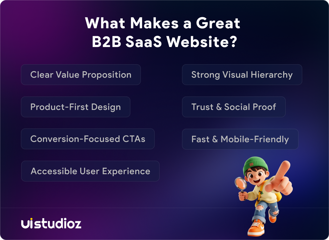
Before looking at these b2b saas website examples, it helps to define what “great” actually means in this category. Great SaaS homepages share a handful of traits, regardless of industry or company size – the same traits show up consistently across strong SaaS landing page examples too.
Clear Value Proposition
The headline should tell a visitor what the product does and who it’s for, without requiring them to scroll. If a stranger can’t explain your product back to you after reading the hero section, the messaging needs work. This is the single biggest differentiator between a converting homepage and a confusing one.
Product-First Design
The best SaaS websites show the interface early – a dashboard preview, a live demo, or an interactive product screenshot – instead of relying on abstract illustrations. Visitors trust what they can see working.
Strong Visual Hierarchy
Typography, spacing, and layout should guide the eye naturally from headline to proof to call to action. Good visual hierarchy reduces cognitive load and makes complex products feel approachable.
Social Proof & Trust Signals
Customer logos, testimonials, case studies, and trust badges reassure buyers that other serious companies already rely on the product. For B2B audiences with long sales cycles, this proof often matters more than the design itself.
Conversion-Focused CTAs
One primary CTA button, repeated consistently, outperforms a page cluttered with competing actions. Whether it’s “Book a Demo” or “Start Free Trial,” the path forward should be obvious. Agencies that specialize in Webflow CRO services often start here, because CTA clarity alone can move conversion rates significantly.
Fast Performance & Mobile Experience
A beautiful homepage that loads slowly loses visitors before they see the design. Mobile responsiveness and Core Web Vitals directly affect both user experience and search rankings.
Accessibility & User Experience
Accessible color contrast, readable typography, and keyboard-friendly navigation aren’t optional extras. They widen the audience a site can serve and increasingly influence how search engines evaluate page quality.
How We Evaluated These B2B SaaS Website Examples
Each website on this list was reviewed against ten practical criteria rather than subjective taste alone:
- Homepage messaging and value proposition clarity
- UI/UX quality
- Product presentation
- Navigation structure
- Visual design and brand consistency
- Conversion strategy
- Page performance
- Mobile responsiveness
- Accessibility
- Overall user experience
This is the same framework our team at Uistudioz uses when auditing client websites, since we work daily on UI UX design services and Webflow design for SaaS and agency clients. After reviewing hundreds of SaaS websites during redesign projects, we’ve noticed that homepage clarity consistently impacts demo requests more than visual effects. Design taste is subjective; conversion behavior isn’t, so the goal here is to separate homepages that merely look good from ones that are actually built to perform.
Top 20 Best B2B SaaS Website Examples
1.Linear
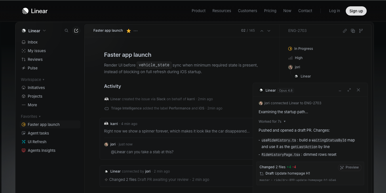
Overview: Linear is a project and issue-tracking platform built for software teams that want speed over feature bloat.
Why It Stands Out: Linear’s homepage is widely referenced as the origin point of the current wave of dark, minimal SaaS design. It uses a near-black canvas, a single restrained purple accent, and dense product screenshots instead of atmospheric stock imagery.
Key Design Highlights: A four-step surface hierarchy instead of heavy shadows, tight negative letter-spacing on large headlines, and a hero that increasingly shows the product actively completing a task rather than a static screenshot.
Takeaway for SaaS Teams: Restraint is a design choice. One accent color, used sparingly, communicates more confidence than five competing brand colors.
2.Stripe
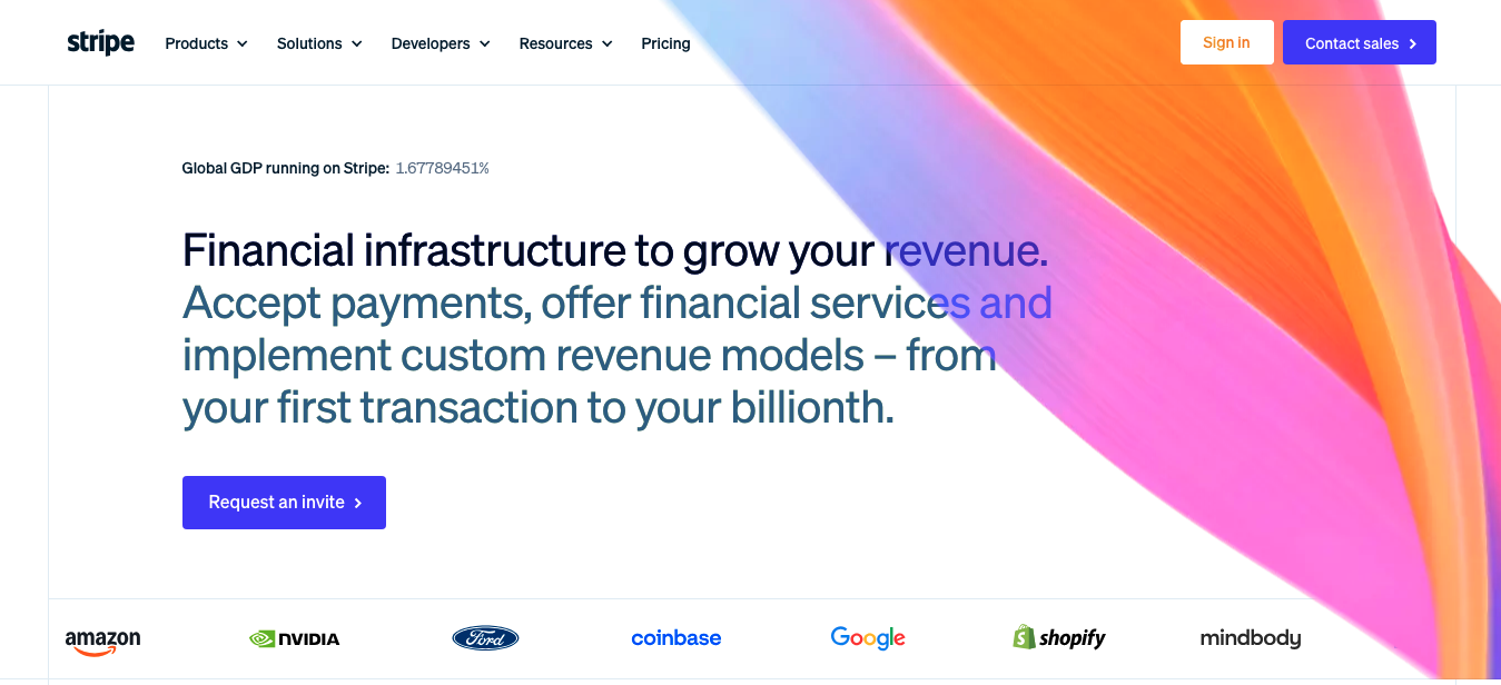
Overview: Stripe provides payment infrastructure and financial APIs for businesses of every size.
Why It Stands Out: Stripe’s site is consistently cited as one of the strongest examples of SaaS product storytelling, blending technical credibility with approachable explanations for non-developer stakeholders.
Key Design Highlights: Gradient-driven WebGL backgrounds, code snippets shown alongside plain-English explanations, and a homepage structure that speaks to developers and finance decision-makers on the same page.
Takeaway for SaaS Teams: A technical product doesn’t need a technical-only homepage. Speak to every stakeholder in the buying committee, not just the end user.
3.Webflow
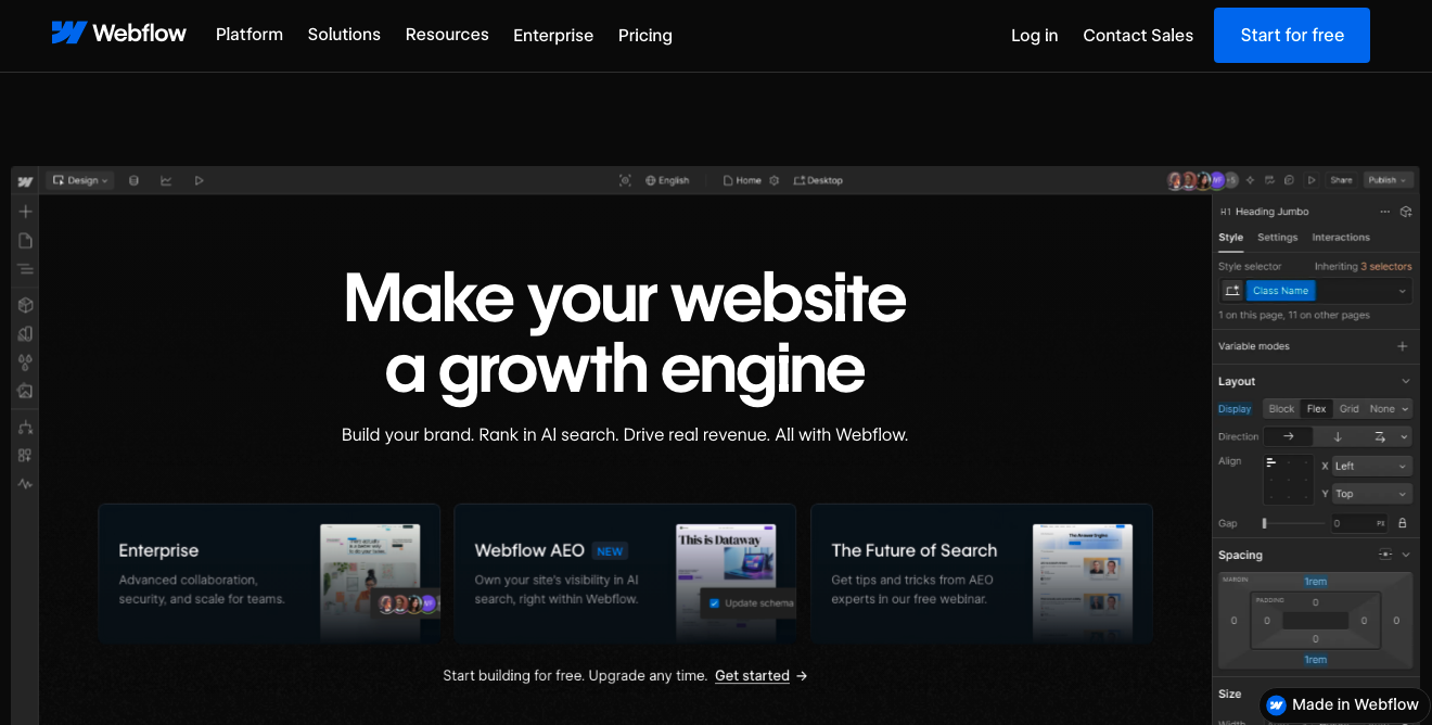
Overview: Webflow is a visual website builder that lets teams design, build, and publish sites without writing code from scratch.
Why It Stands Out: True to its own product, Webflow’s homepage leans on product-first storytelling — the visual builder interface appears almost immediately in the hero section.
Key Design Highlights: Modular feature sections, an interactive product demo instead of a static image, and a navigation structure that segments visitors by role (designers, marketers, agencies).
Takeaway for SaaS Teams: If your product is visual, let visitors interact with a simplified version of it directly on the homepage instead of describing it in paragraphs.
4.Framer
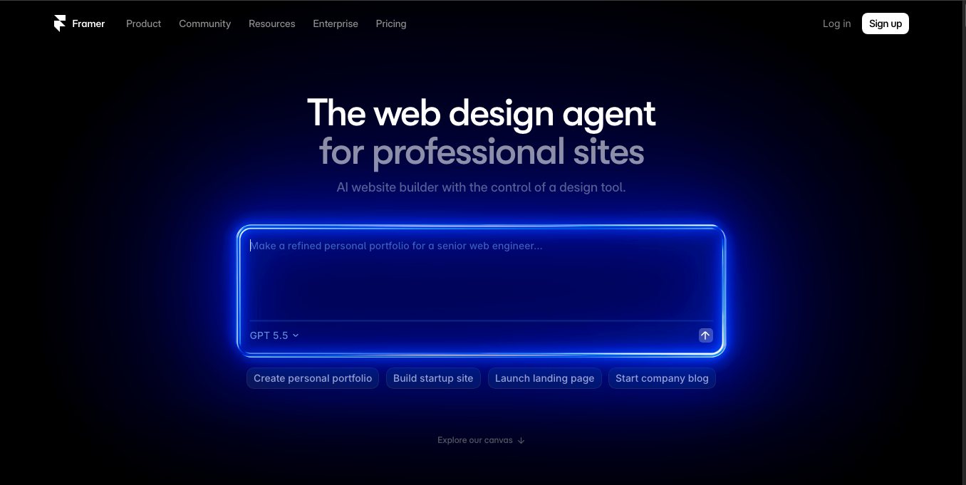
Overview: Framer is a design and website-building tool positioned around speed and a polished, “Apple-like” build experience.
Why It Stands Out: Framer’s site uses kinetic typography, cursor-based interactions, and motion as part of the product pitch itself, not just decoration.
Key Design Highlights: Demo videos explaining differentiation, a shader and motion library used directly in the marketing site, and a navigation bar that clearly separates use cases, templates, and pricing.
Takeaway for SaaS Teams: When motion supports the message instead of distracting from it, it becomes part of the value proposition — not just visual flair.
5.Vercel
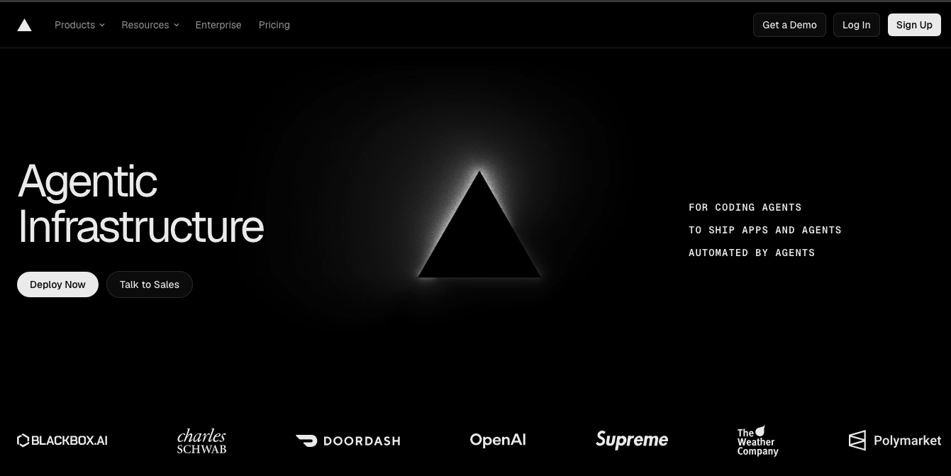
Overview: Vercel is a developer platform for building, deploying, and scaling modern web applications.
Why It Stands Out: Vercel’s homepage is frequently held up as a benchmark for WebGL and gradient craft in developer-facing SaaS design.
Key Design Highlights: A high-contrast black-and-white base with selective gradient accents, terminal-style visuals that speak directly to a developer audience, and fast, minimal page weight despite the visual complexity.
Takeaway for SaaS Teams: Design language should match your audience’s technical fluency. Developers respond to precision and performance as much as visuals.
6.Figma
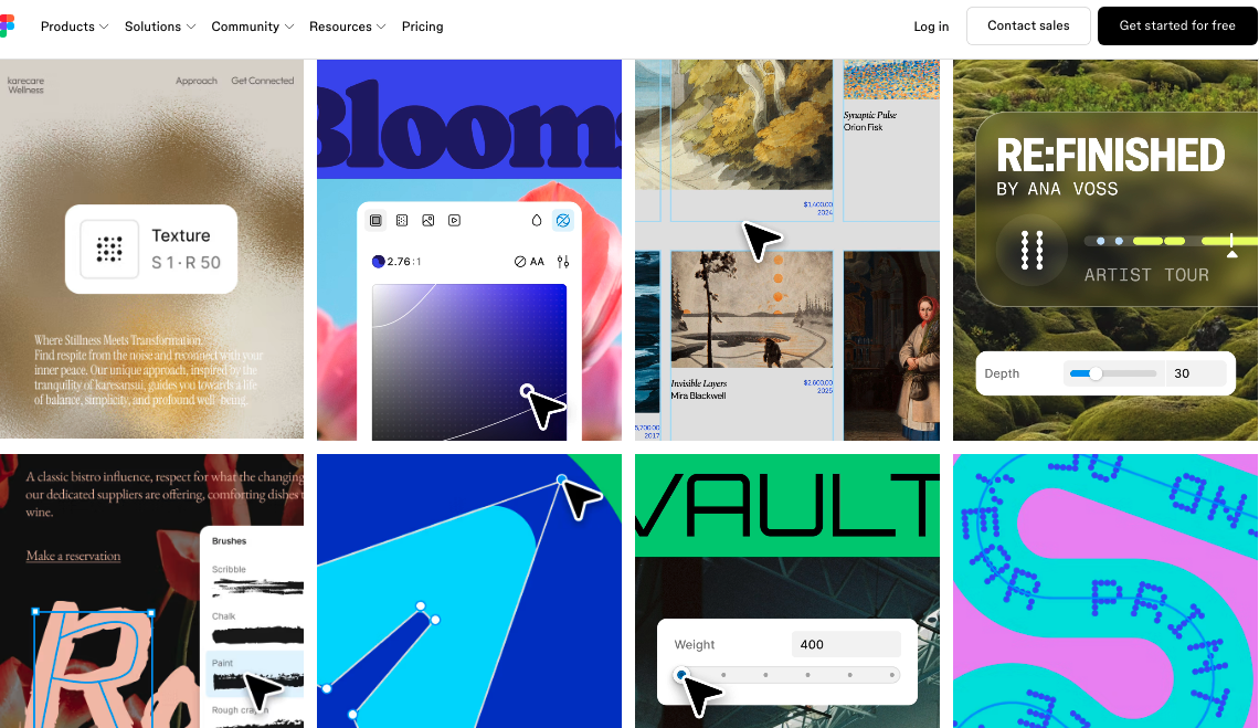
Overview: Figma is a cloud-based design and collaboration platform used by product, design, and engineering teams together.
Why It Stands Out: As a design-collaboration product, Figma’s own homepage is naturally held to a higher visual standard — and it delivers with colorful, playful illustrations balanced against clean product screenshots.
Key Design Highlights: Real-time collaboration visuals shown directly in the hero, community-driven content sections, and a warm, approachable color palette that softens what is otherwise a technical tool.
Takeaway for SaaS Teams: If collaboration is your core value proposition, show people actually collaborating — cursors, comments, and live edits — rather than describing the feature in text.
7.Notion
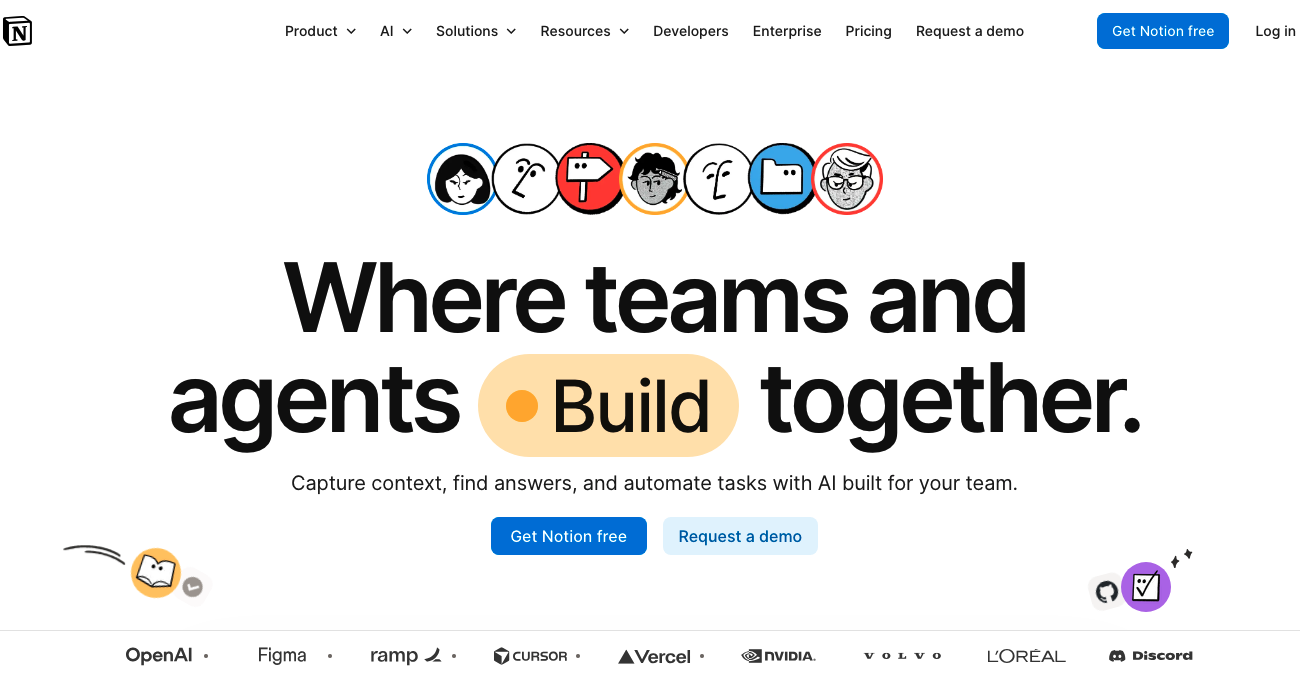
Overview: Notion is an all-in-one workspace for notes, docs, projects, and knowledge management.
Why It Stands Out: Notion deliberately avoids the dark, gradient-heavy aesthetic common across SaaS in 2026, instead using an editorial, content-first layout that feels more like a publication than a typical product page.
Key Design Highlights: Minimal color use, generous whitespace, and template galleries that let visitors see real use cases instead of abstract feature lists.
Takeaway for SaaS Teams: You don’t need to follow the dominant design trend to stand out. Sometimes refusing it is the differentiator.
8.Attio
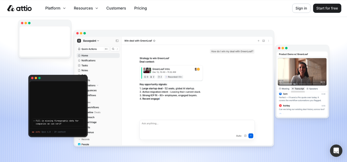
Overview: Attio is an AI-native CRM built for go-to-market teams.
Why It Stands Out: Attio has become one of the most frequently referenced design-forward B2B sites of 2026, rivaling Linear for top billing in CRM design.
Key Design Highlights: A sleek monochrome layout with bold typography, light-to-dark transitions, and a hero section that runs a live natural-language query against the product itself instead of a static screenshot.
Takeaway for SaaS Teams: Letting visitors see the product actually “think” or respond in real time builds more trust than any amount of marketing copy.
9.Intercom
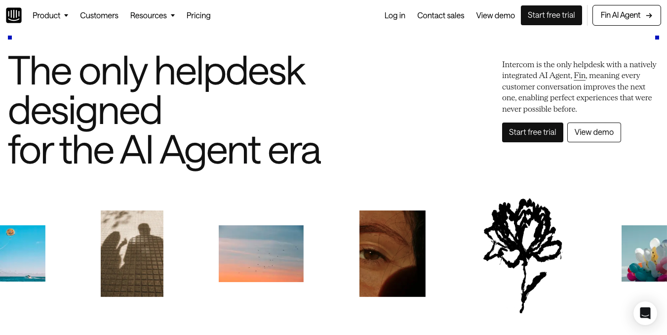
Overview: Intercom is a customer communication platform combining live chat, support, and AI-driven engagement tools.
Why It Stands Out: Intercom balances a friendly, conversational brand voice with a genuinely complex product, using illustration and product UI side by side.
Key Design Highlights: Chat-bubble visual motifs that reinforce the product category at a glance, clear role-based navigation, and customer proof placed close to the fold rather than buried at the bottom.
Takeaway for SaaS Teams: Your visual motifs should reflect what your product actually does. A conversation-based product should visually feel like a conversation.
10.HubSpot
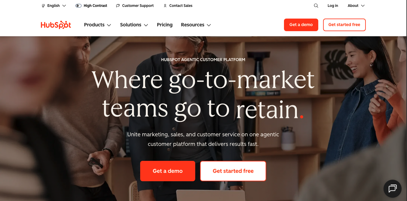
Overview: HubSpot is a CRM and marketing platform serving sales, marketing, and service teams.
Why It Stands Out: HubSpot’s homepage manages a difficult balance: a broad, multi-product suite explained clearly enough for a first-time visitor to understand in seconds.
Key Design Highlights: A confident, consistent orange brand accent, education-led content sections, and a homepage structure built around role-based entry points for different buyer personas.
Takeaway for SaaS Teams: When you sell more than one product, don’t force every visitor through the same path. Segment early and let them self-select.
11.Airtable
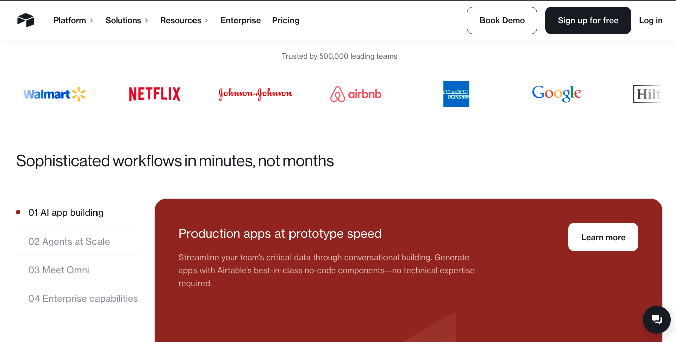
Overview: Airtable is a flexible workflow database that blends the simplicity of a spreadsheet with database-level power.
Why It Stands Out: Airtable’s homepage translates a genuinely abstract product — a spreadsheet-database hybrid — into concrete, colorful use-case visuals.
Key Design Highlights: Colorful grid-based product previews, industry-specific templates shown directly on the homepage, and a layout that leans on real data views instead of abstract graphics.
Takeaway for SaaS Teams: If your product is hard to explain in words, let a real, populated interface do the explaining instead.
12.Ramp
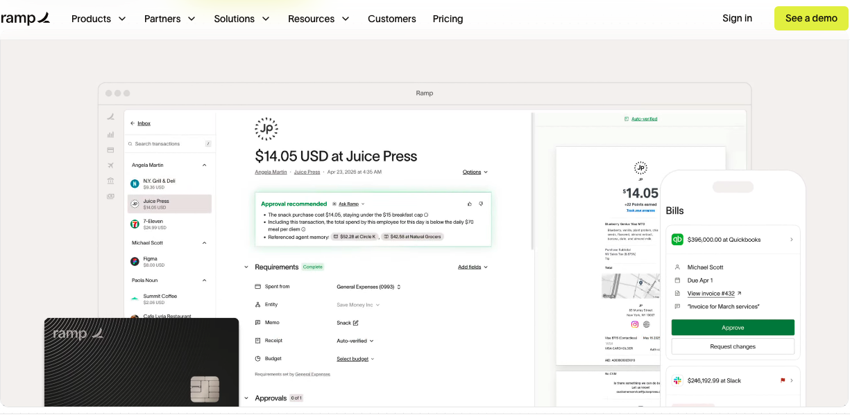
Overview: Ramp is a corporate finance and expense management platform aimed at modern finance teams.
Why It Stands Out: Ramp turned the bento-grid layout trend into a formal internal design system, applying strict grid rules, uniform gutters, and consistent card sizing across every feature section.
Key Design Highlights: A disciplined bento-grid structure, sharp typography suited to a finance audience, and numbers-driven proof points placed prominently near the hero.
Takeaway for SaaS Teams: A rigid, well-documented grid system creates consistency at scale – useful once your marketing site grows beyond a handful of pages.
13.Rippling
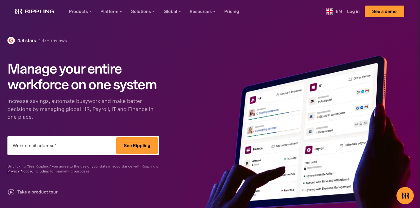
Overview: Rippling is an HR, IT, and finance platform that unifies employee management under one system.
Why It Stands Out: Rippling’s homepage tackles a genuinely complex, multi-product platform by leading with a single unifying idea – one system of record for a company’s workforce – before breaking it into modules.
Key Design Highlights: A clean corporate palette, modular sections for each product line (HR, IT, Finance), and enterprise-focused trust signals like compliance and security messaging.
Takeaway for SaaS Teams: Complex platforms need one clear unifying message before they introduce feature complexity, not the other way around.
14.Deel
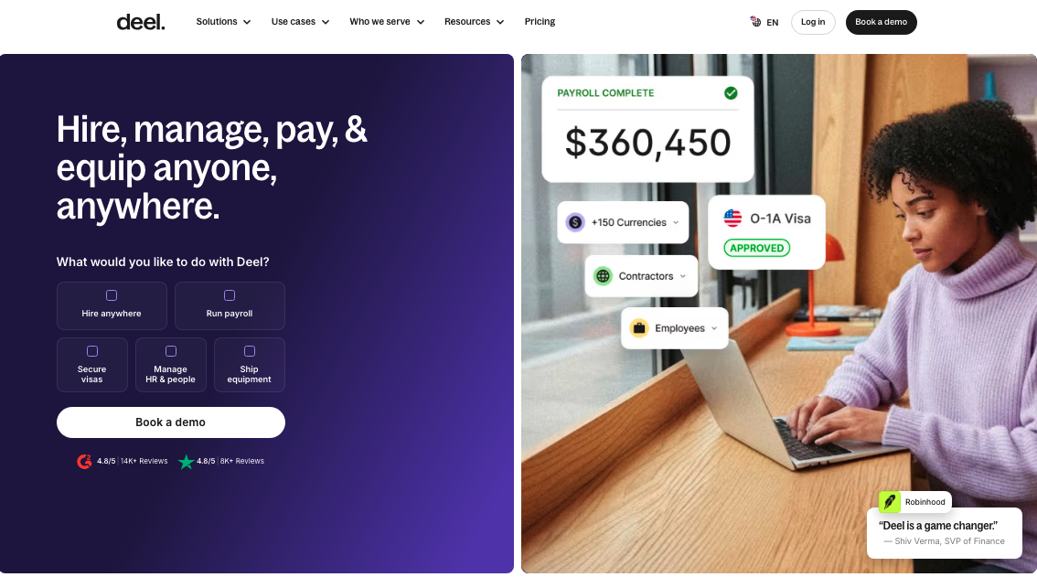
Overview: Deel is a global payroll and HR platform built for hiring and paying international teams.
Why It Stands Out: Deel’s design leans into its global positioning, using country and currency visuals and clear compliance messaging to build trust with international buyers.
Key Design Highlights: Map and globe-based visual motifs, localized proof points, and a homepage structure that speaks directly to the complexity of cross-border hiring.
Takeaway for SaaS Teams: If global reach is part of your value proposition, make that visible in the design itself, not just in the copy.
15.Clay
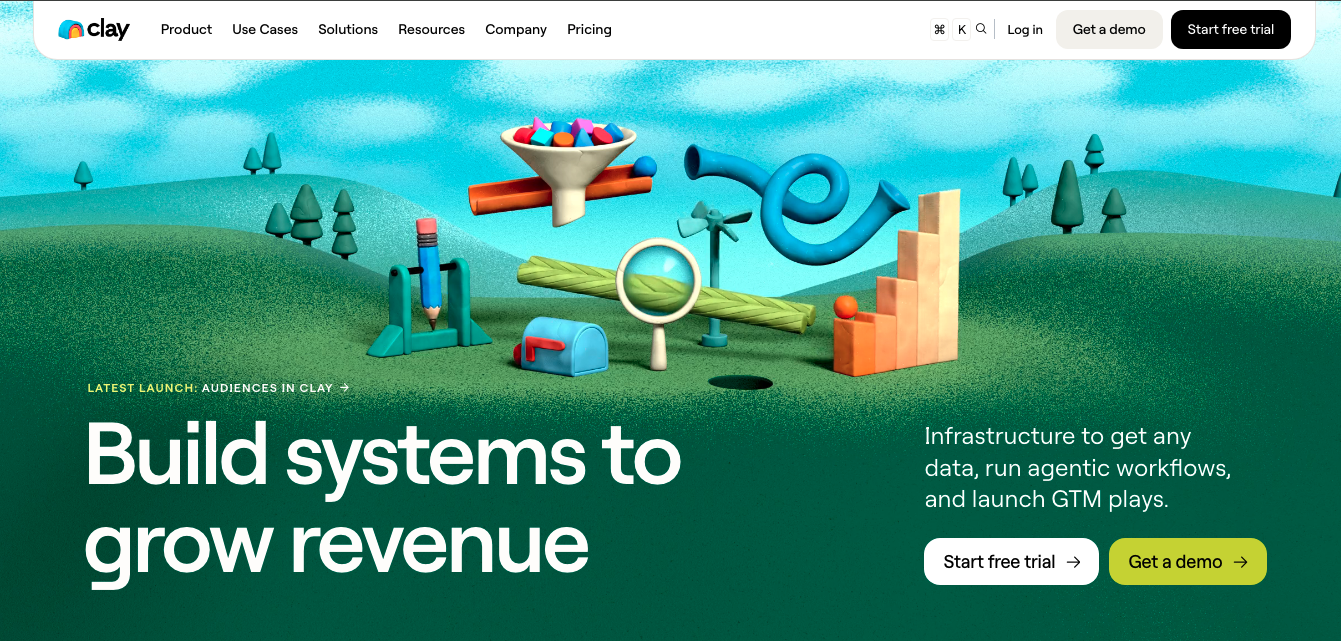
Overview: Clay is a sales intelligence and data enrichment platform built for outbound go-to-market teams.
Why It Stands Out: Clay blends bold typography, straightforward product demos, and a distinct visual identity that reappears consistently across the site, making the brand instantly recognizable.
Key Design Highlights: A visually ambitious, design-award-recognized homepage, minimal illustration paired with real workflow previews, and a logo treatment used creatively throughout the page.
Takeaway for SaaS Teams: Consistent, distinctive brand elements – repeated deliberately – make a homepage memorable even in a crowded category.
16.Loom
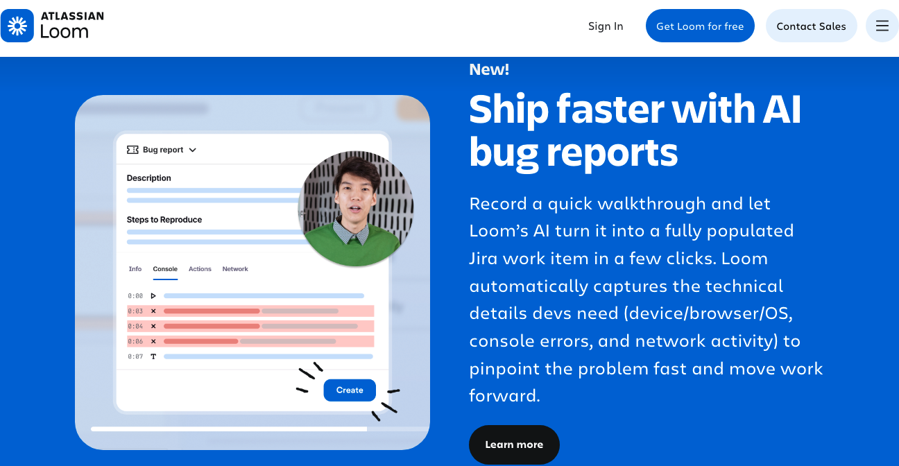
Overview: Loom is a video messaging tool for async communication between teams.
Why It Stands Out: As a video-first product, Loom’s homepage naturally leans on video previews and playful, human-centered visuals instead of dense text blocks.
Key Design Highlights: Video-led hero sections, a friendly and approachable brand voice, and simple, benefit-led copy suited to a broad, non-technical audience.
Takeaway for SaaS Teams: Let your primary content format double as your homepage’s main visual asset. A video tool should look and feel like video.
17.Miro
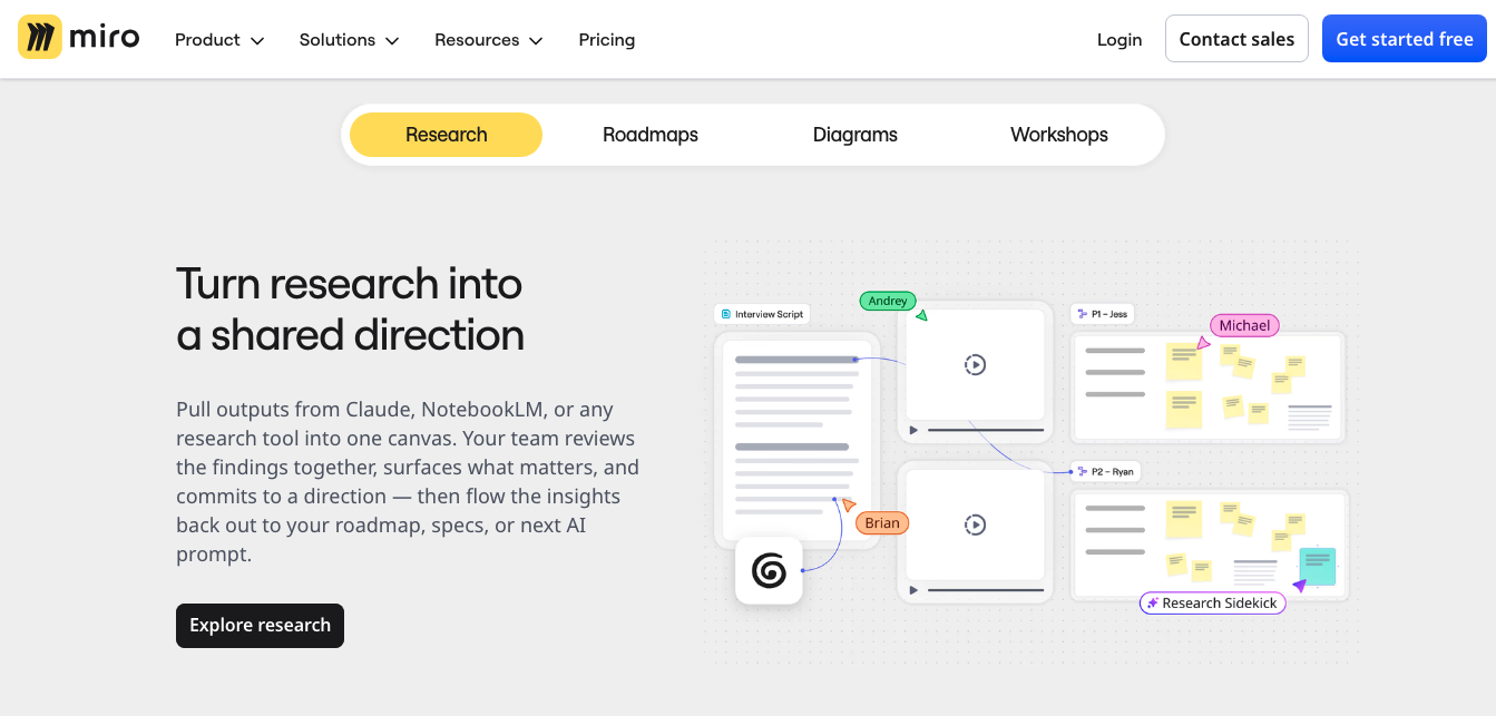
Overview: Miro is an online collaborative whiteboard platform used for brainstorming, planning, and cross-team workflows.
Why It Stands Out: Miro’s homepage mirrors its own product — an open, visual canvas — using illustrated boards and collaborative visuals to demonstrate the experience directly.
Key Design Highlights: Whiteboard-style illustrations, use-case-driven sections for different teams (product, design, engineering, marketing), and clear template galleries.
Takeaway for SaaS Teams: A visual product deserves a visual homepage. Don’t describe an open canvas in a bulleted list — show it.
18.Retool
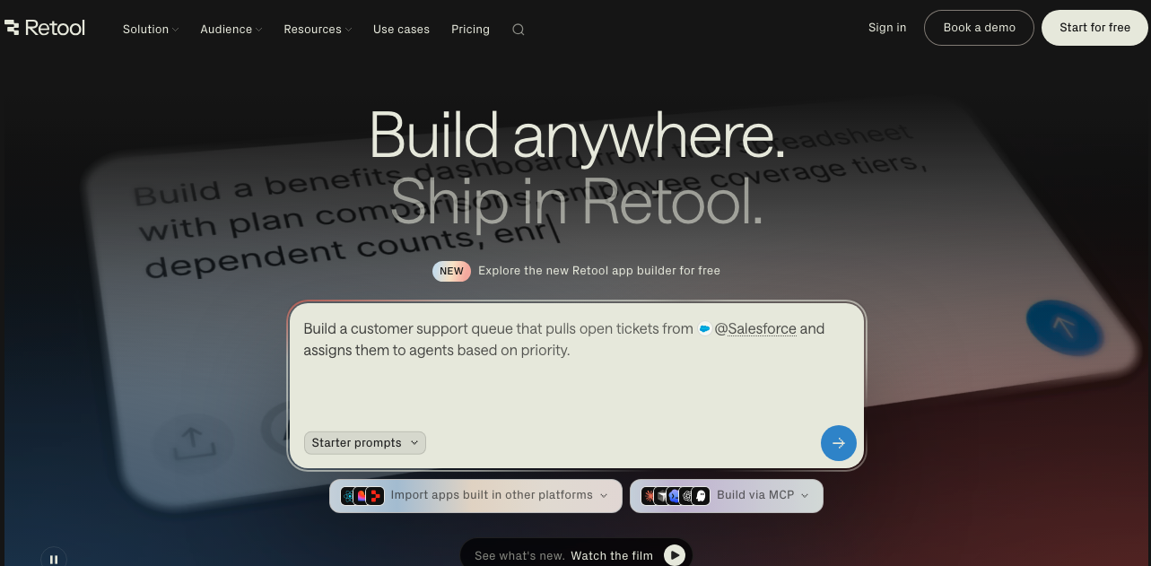
Overview: Retool is a platform for building internal tools and business applications quickly, aimed at engineering and product teams.
Why It Stands Out: Retool’s integration directory is often cited as a reference standard, with a large library of integrations organized so clearly it feels like part of the product rather than a marketing afterthought.
Key Design Highlights: Developer-focused UI previews, a well-organized integrations section, and industry-specific landing pages that speak directly to different buyer verticals.
Takeaway for SaaS Teams: If integrations are a selling point, treat that directory as a first-class page, not a footnote. A well-built Webflow integration setup can make this kind of directory far easier to maintain at scale.
19.Zapier
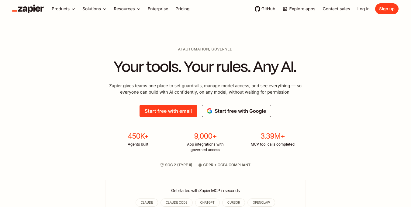
Overview: Zapier is an automation platform that connects apps and automates workflows without code.
Why It Stands Out: Zapier’s homepage focuses on breadth – thousands of app integrations – while keeping the core message simple: connect your tools, automate the busywork.
Key Design Highlights: App-logo-driven visuals that immediately communicate ecosystem scale, a clean orange brand accent, and use-case examples tailored to different roles and industries.
Takeaway for SaaS Teams: When your core strength is breadth (many integrations, many use cases), visualize that scale directly instead of only claiming it in text.
20.Sentry
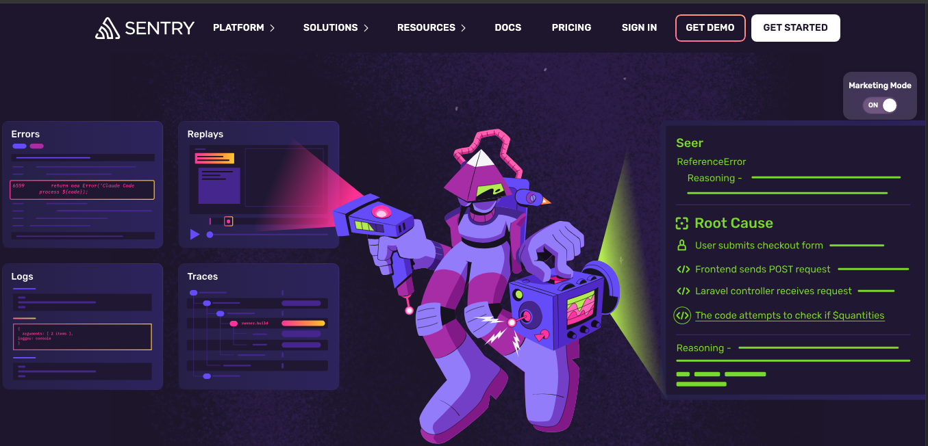
Overview: Sentry is an application monitoring and error-tracking platform built for developers.
Why It Stands Out: Sentry’s homepage speaks fluently to a developer audience, using dark, code-adjacent visuals and technically precise language instead of generic marketing phrasing.
Key Design Highlights: Terminal and log-style visuals, dark mode by default, and a homepage that assumes technical familiarity rather than explaining basics.
Takeaway for SaaS Teams: Know your audience’s fluency level. A developer-only product can afford – and often benefits from – more technical, less “marketing-polished” language.
Quick Comparison of the Top 20 SaaS Websites
The table below lines up all 20 b2b saas website examples side by side, so you can scan category, platform, and standout feature at a glance.
| Company | Platform | Category | Best For | Standout Feature |
| Linear | Custom Build | Project Management | Software teams | Minimal dark UI, single accent color |
| Stripe | Custom Build | Payments | Developers & finance teams | Gradient storytelling, dual-audience messaging |
| Webflow | Webflow | Website Builder | Designers & marketers | Product-first, interactive hero |
| Framer | Framer | Website Builder | Designers | Motion and kinetic typography |
| Vercel | Custom Build | Developer Platform | Engineering teams | High-contrast, performance-led design |
| Figma | Custom Build | Design Collaboration | Design & product teams | Real-time collaboration visuals |
| Notion | Custom Build | Workspace | Knowledge teams | Editorial, content-first layout |
| Attio | Custom Build | AI CRM | Go-to-market teams | Live AI-powered hero demo |
| Intercom | Custom Build | Customer Communication | Support & sales teams | Conversational visual motifs |
| HubSpot | Custom Build | CRM | Marketing & sales teams | Role-based segmentation |
| Airtable | Custom Build | Workflow Database | Ops & project teams | Colorful, real-data previews |
| Ramp | Custom Build | Finance | Finance teams | Bento-grid design system |
| Rippling | Custom Build | HR Platform | HR & IT teams | Unified multi-product messaging |
| Deel | Custom Build | Global HR | Global teams | Localized, compliance-led design |
| Clay | Custom Build | Sales Intelligence | GTM & sales teams | Distinctive brand identity |
| Loom | Custom Build | Video Communication | Async teams | Video-led hero |
| Miro | Custom Build | Online Whiteboard | Cross-functional teams | Illustrated collaborative canvas |
| Retool | Custom Build | Internal Tools | Engineering teams | Best-in-class integration directory |
| Zapier | Custom Build | Automation | Ops teams | Ecosystem-scale visuals |
| Sentry | Custom Build | Developer Monitoring | Developers | Technical, no-frills dark UI |
Note: “Platform” reflects each company’s own public-facing marketing site. Most enterprise SaaS brands at this scale run fully custom-coded sites rather than website builders – Webflow and Framer are the two exceptions on this list, since they showcase their own product.
Common Design Patterns Behind the Best B2B SaaS Websites
Looking across these leading SaaS companies, a few patterns repeat regardless of industry or company size – and they offer solid SaaS UI inspiration for your own redesign:
- Clear messaging above the fold. Every site states what the product does before asking for anything in return.
- Real product screenshots instead of stock visuals. Buyers trust interfaces they can actually see working.
- One primary CTA, repeated consistently rather than competing with secondary actions.
- Customer logos and testimonials placed close to the point of decision, not buried in a separate page.
- Simple, role-based navigation that doesn’t force every visitor down the same path.
- Fast-loading pages, since performance directly affects both conversions and search visibility.
- Minimal yet effective layouts that prioritize whitespace over dense information.
- Consistent design systems that carry the same type, color, and spacing rules across every page, not just the homepage.
Agencies that focus on website design for SaaS clients tend to build these patterns into a reusable design system from day one, rather than retrofitting them after launch.
B2B SaaS Website Design Trends for 2026
A few shifts are shaping how SaaS web design is evolving this year:
- AI-powered personalization, where homepage content adapts based on visitor role, industry, or referral source.
- Interactive product demos replacing static screenshots, letting visitors try a simplified version of the product directly on the page.
- Motion UI and micro-interactions used purposefully hover states, scroll-triggered reveals – rather than as decoration.
- Accessibility-first design, with contrast, keyboard navigation, and screen-reader support built in from the start rather than patched in later.
- Product-led onboarding, where the homepage itself functions as the first step of the user journey instead of a separate marketing layer.
- Minimal navigation, trimming menus down to the handful of paths that actually matter to a buyer.
- Core Web Vitals optimization, since page speed now directly influences both rankings and conversion rates. This is a core part of proper Webflow SEO work, and increasingly a differentiator for AI-driven search visibility too.
- Modern typography and generous whitespace, favoring large, confident type over dense, cluttered layouts — a hallmark of good SaaS homepage design.
AI-native categories in particular — tools built around large language models and autonomous agents — are pushing this shift further, and it’s a space our team tracks closely through dedicated Webflow for AI companies work, making SaaS website inspiration for 2026 look noticeably different from even a year ago.
Key Design Lessons You Can Apply to Your SaaS Website
You don’t need a Linear-sized design team to apply what makes these b2b saas website examples work. The underlying principles scale down easily:
- Lead with a clear value proposition. State what the product does and who it’s for in the first sentence a visitor reads.
- Show the product early. A real screenshot or short demo beats a paragraph of feature descriptions.
- Keep navigation simple. Fewer menu items mean less decision fatigue for the visitor.
- Build trust with real customer proof. Logos, quotes, and case studies should feel specific, not generic.
- Focus on one primary CTA. Decide what you want the visitor to do next, and repeat that single action consistently.
- Design for mobile first. A growing share of B2B research now happens on mobile devices before a desktop session even begins.
- Prioritize speed and usability over decorative complexity that slows the page down.
- Maintain a consistent design system across every page, not just the homepage, so the brand feels cohesive site-wide.
If your team needs help translating these lessons into an actual build, Webflow for SaaS projects are exactly the kind of work a specialized team can move quickly on, since the platform is already built for this level of design flexibility.
Common Mistakes to Avoid
Even well-funded SaaS companies fall into the same traps that weaken otherwise promising b2b saas website examples:
- Generic messaging that could apply to any competitor in the category.
- A weak hero section that buries the value proposition below unnecessary visuals.
- Too many CTAs competing for attention instead of one clear next step.
- Hidden pricing, which frustrates buyers who want to self-qualify before booking a call – a pricing page that’s easy to find builds more trust than it costs in negotiating leverage.
- No product preview, forcing visitors to imagine what the interface looks like.
- Slow-loading pages, often caused by unoptimized images or bloated scripts left unaddressed after launch; this is exactly what ongoing Webflow maintenance is meant to prevent.
- Poor mobile experience, where desktop-first layouts break down on smaller screens.
- Inconsistent branding across pages, which undermines credibility built on the homepage.
- Ignoring accessibility, which narrows the audience and can affect search performance.
Final Thoughts
The strongest SaaS homepage examples on this list don’t win because of trend-chasing visuals. They win because every design decision – the headline, the product preview, the CTA, the page speed serves one goal: helping a visitor understand the product and take the next step with confidence.
The biggest takeaway from studying Linear, Stripe, Attio, Webflow, and the rest of this list is that clarity consistently beats complexity. Use these b2b saas website examples as a reference point for SaaS website inspiration, not a template to copy directly – the right design for your SaaS product depends on your audience, your product complexity, and how your buyers actually make decisions.
Whether you’re building an AI startup, fintech platform, HR software, or developer tool, the best SaaS websites share the same foundation: clarity, trust, and usability. Borrow the principles – not the visuals – and you’ll create a website that converts more visitors into customers.
If you’re ready to apply these lessons to your own site, contact us and our team can walk you through what a redesign would look like for your product.

Frequently Asked Questions
What is a B2B SaaS website?
A B2B SaaS website is the marketing site for a software-as-a-service product sold to other businesses rather than individual consumers. It typically needs to address multiple stakeholders in a buying committee, not just a single end user.
What makes a good SaaS homepage?
The best SaaS homepage combines a clear value proposition, an early product preview, credible social proof, and one obvious call to action, all wrapped in a fast, mobile-friendly experience.
Which companies have the best SaaS websites?
Companies like Linear, Stripe, Attio, and Webflow are consistently cited across design roundups as strong b2b saas website examples worth studying, but “best” depends on your product category and target buyer.
How do SaaS websites increase conversions?
By reducing friction: clear messaging, fewer competing CTAs, visible pricing, real product previews, and fast page load times all remove reasons for a visitor to leave before converting.
What are the latest SaaS website design trends?
Interactive product demos, AI-driven personalization, accessibility-first layouts, and Core Web Vitals optimization are shaping SaaS design in 2026.