Your website might be driving visitors away without you even realizing it—and the culprit could be hiding in plain sight: your color scheme.
Color psychology in website design isn’t just about making things look pretty. It’s a strategic approach that influences user behavior, builds trust, and ultimately drives conversions. Studies show that up to 90% of snap judgments about products are based on color alone, and website visitors form opinions about your brand within 0.05 seconds of landing on your page.
Whether you’re wondering how to choose a website color scheme that converts or which colors build trust on websites, understanding the psychology behind website color choices is essential for creating user experiences that actually work.
In this comprehensive guide, you’ll learn what color psychology is, how colors affect user behavior on websites, practical tips for choosing the right color strategy for conversions, and real-world examples of brands getting it right. By the end, you’ll have a clear framework for implementing color psychology in your UI/UX design strategy.
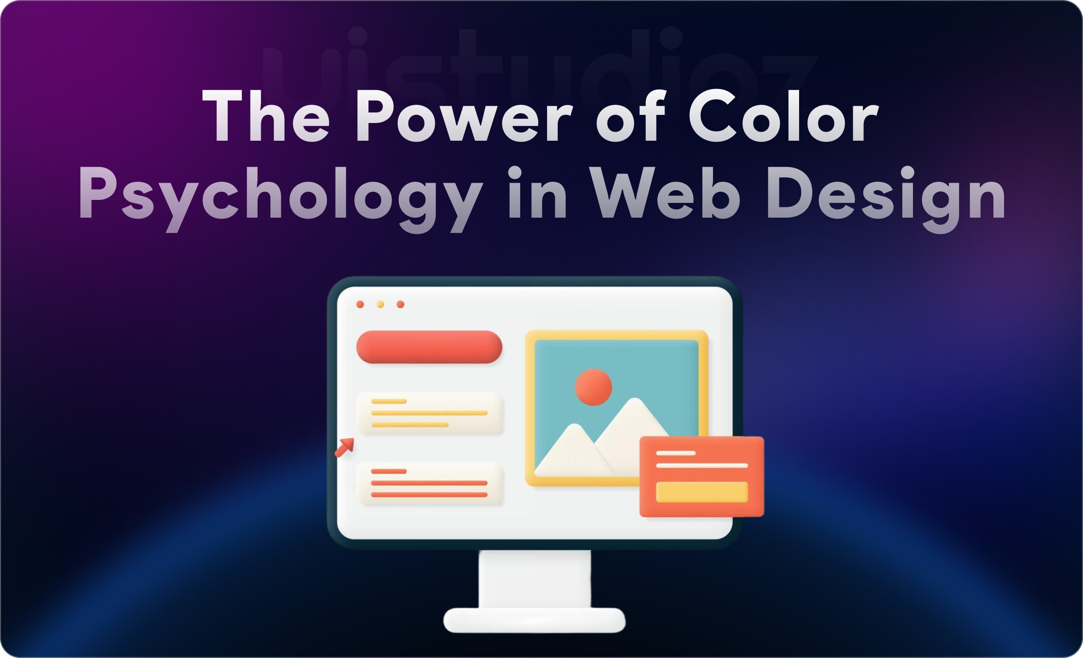
What Is Color Psychology in Website Design?
Color psychology in web design is the study of how colors influence human emotions, perceptions, and actions when interacting with digital interfaces. It’s rooted in both science and cultural associations—certain colors trigger specific psychological responses that designers can leverage to guide user behavior.
When users land on your website, their brain processes color before text, images, or layout. This immediate visual processing creates an emotional response that shapes their entire experience with your brand. A financial services website using calming blues communicates trustworthiness, while a fitness brand using energetic reds conveys motivation and action.
In UI/UX design, color psychology serves multiple purposes: it establishes visual hierarchy, directs attention to important elements like CTAs, reinforces brand identity, and creates emotional connections. Understanding these principles helps designers make intentional choices rather than selecting colors based solely on personal preference—a key principle we emphasize in our approach to building brand-first websites.
Why Color Psychology Matters for Websites
First Impressions Are Visual
You have less than a second to make a positive first impression online. Color is the most immediate visual element users process, influencing whether they stay or bounce. The impact of colors in web design on first impressions can’t be overstated—the right palette creates instant credibility.
Brand Perception and Recognition
Consistent color use increases brand recognition by up to 80%. When users see your signature colors across touchpoints, they build mental associations with your brand values. This is why the importance of color in website design extends far beyond aesthetics—it’s a core component of brand strategy.
Building User Trust and Engagement
Certain colors naturally build trust on websites. Financial institutions overwhelmingly use blue because research shows it’s associated with security and reliability. Healthcare sites use green to convey wellness and calm. These aren’t random choices—they’re strategic decisions based on how colors influence user experience online.
Conversion Optimization
The website color strategy for conversions involves more than picking attractive hues. Strategic color use can increase conversions by up to 24% when applied to CTAs, forms, and key decision points. Understanding how color psychology affects website conversions allows you to guide users toward desired actions subtly but effectively.
Meaning of Colors in Web Design (With Examples)
Red: Energy, Urgency, and Action
Red is the most attention-grabbing color in the spectrum, making it perfect for creating urgency and driving immediate action.
Psychological effects: Increases heart rate, creates urgency, stimulates appetite, conveys passion and excitement
Best uses: CTA buttons, sale announcements, clearance tags, food industry websites
Examples: Netflix uses red to convey excitement and entertainment. Target built an entire brand identity around red to create an energetic shopping experience.
Caution: Overuse can create anxiety or aggression. Use strategically for accents and CTAs rather than large background areas.
Blue: Trust, Security, and Professionalism
Blue is the most universally preferred color and the safest choice when building trust is your primary goal.
Psychological effects: Calms the mind, builds trust, conveys competence, reduces stress
Best uses: Financial services, healthcare, technology, corporate websites
Examples: PayPal, Facebook, and LinkedIn all use blue to communicate reliability and professionalism. Banks almost universally incorporate blue in their website color schemes.
Caution: Can feel cold or impersonal if used exclusively without warmer accent colors.
Green: Growth, Health, and Balance
Green represents nature, health, and prosperity—making it ideal for brands emphasizing wellness or sustainability.
Psychological effects: Creates calm, represents growth, associated with money and success, symbolizes environmental consciousness
Best uses: Wellness brands, environmental companies, financial growth services, organic products
Examples: Whole Foods uses green to emphasize natural, organic values. Spotify uses green to stand out while conveying creativity and freshness.
Caution: Different shades convey different meanings—bright green is energetic, while darker green suggests wealth and stability.
Yellow: Optimism, Attention, and Cheerfulness
Yellow is the brightest color and naturally draws the eye, but requires careful implementation.
Psychological effects: Stimulates mental activity, creates happiness, grabs attention quickly, conveys optimism
Best uses: Accent color, highlighting important information, children’s products, creative industries
Examples: Best Buy uses yellow to create an energetic, accessible shopping experience. McDonald’s combines yellow with red to stimulate appetite and quick decision-making.
Caution: Overwhelming in large doses and can cause eye strain. Best used sparingly as an accent.
Black: Luxury, Power, and Sophistication
Black conveys exclusivity and elegance when used strategically in web design.
Psychological effects: Creates sophistication, suggests luxury, conveys authority, provides strong contrast
Best uses: Luxury brands, high-end products, minimalist designs, photography portfolios
Examples: Chanel and other luxury brands use black extensively to communicate exclusivity. Apple uses black in product pages to emphasize premium quality.
Caution: Can feel heavy or oppressive if overused. Balance with white space and lighter accents.
White: Simplicity, Cleanliness, and Space
White (or whitespace) is essential for modern web design, creating breathing room and clarity.
Psychological effects: Communicates cleanliness, creates simplicity, provides mental rest, suggests modernity
Best uses: Minimalist designs, healthcare, tech companies, backgrounds and spacing
Examples: Google’s homepage is famously minimal, using white space to focus attention on the search bar. Apple’s product pages use white to emphasize product features.
Caution: Too much white can feel empty or sterile. Balance with purposeful color accents.
How Colors Influence User Behavior
Understanding how colors affect user behavior on websites goes beyond knowing what each color “means”—it’s about recognizing how color influences actual decisions and actions.
Emotional Triggers and Decision-Making
Colors create subconscious emotional responses that influence how users perceive information and make decisions. Warm colors (red, orange, yellow) create excitement and urgency, often speeding up decision-making. Cool colors (blue, green, purple) promote careful consideration and trust, slowing down the decision process in a positive way.
This is why e-commerce sites use red for “Sale” and “Limited Time” offers—the color itself triggers urgency. Meanwhile, financial platforms use blue to encourage users to slow down and feel confident about important decisions.
Attention and Visual Hierarchy
Strategic color use creates visual hierarchy using color in UI, guiding users’ eyes to the most important elements first. High-contrast colors naturally draw attention, which is why CTAs often use colors that contrast sharply with the rest of the page.
The 60-30-10 rule works well here: 60% dominant color (usually neutral), 30% secondary color (brand color), and 10% accent color (for CTAs and key actions). This approach, which we implement in our website design services, creates clear visual paths without overwhelming users.
CTA Effectiveness and Conversion Impact
The emotional impact of colors in design is perhaps most measurable in call-to-action buttons. While there’s no universally “best” color for website conversions, contrast and context matter tremendously.
A red button on a predominantly blue website will perform better than a light blue button, simply because it stands out. However, that same red button on a red-heavy website would disappear. The key is understanding how do colors influence buying decisions online within your specific design context.
Research from HubSpot showed that red CTA buttons outperformed green ones by 21% in their specific context—not because red is universally better, but because it created stronger contrast in that particular design.
How to Choose the Right Color Scheme for Your Website
Selecting the best colors for website design and branding requires a strategic approach, not guesswork.
Understand Your Brand Personality
Start by defining your brand’s personality traits. Are you innovative or traditional? Playful or serious? Luxurious or accessible?
Create a list of 3-5 adjectives that describe your brand, then research which colors align with those traits. A law firm emphasizing “trustworthy, professional, and established” would naturally gravitate toward blues and grays, while a children’s educational platform describing itself as “fun, creative, and energetic” might choose bright primary colors.
Know Your Target Audience
Color preferences vary by age, gender, culture, and context. While blue is generally safe across demographics, understanding your specific audience helps you make nuanced decisions.
B2B audiences typically respond better to professional, subdued palettes (blues, grays, greens). B2C audiences, especially in retail or entertainment, often prefer bolder, more emotional color schemes. Research has shown that women generally prefer softer colors while men prefer bolder, brighter tones—though these are tendencies, not rules.
Cultural considerations are crucial for global audiences. White symbolizes purity in Western cultures but mourning in some Eastern cultures. Red means luck and prosperity in China but danger in Western contexts.
Analyze Competitors
Research how competitors in your space use color—not to copy them, but to understand industry conventions and opportunities to differentiate.
If every competitor uses blue, you might choose blue to fit industry expectations (financial services) or deliberately choose a different color to stand out (like ING’s orange in banking). The key is making an informed choice, not following trends blindly.
Use Color Theory Basics
Understanding fundamental color theory for web designers helps create harmonious, effective palettes:
Complementary colors (opposite on the color wheel) create high contrast and energy—use for CTAs that need to pop.
Analogous colors (adjacent on the color wheel) create harmony and cohesion—use for backgrounds and large areas.
Triadic colors (evenly spaced on the color wheel) create balanced, vibrant palettes—use when you need variety without chaos.
Tools like Adobe Color, Coolors, and Paletton help you generate and test color schemes based on these principles.
Test and Optimize
The only way to know which color is best for website conversion in your specific context is through A/B testing. Test CTA button colors, headline colors, and background variations with real users.
Start with high-impact elements (primary CTA buttons) before testing subtler variations. Track not just clicks, but conversions and user engagement time. Remember that UI/UX design principles should always be validated with real user data, not assumptions.
Common Color Mistakes in Website Design
Even experienced designers make these color psychology mistakes that hurt user experience and conversions.
Using Too Many Colors
More colors don’t mean better design. When websites use more than 3-4 primary colors, they create visual chaos that overwhelms users and dilutes brand identity. Stick to a primary color, secondary color, and one or two accent colors for CTAs and highlights.
Poor Contrast (Hurts Readability)
Low contrast between text and background creates accessibility issues and user frustration. Light gray text on white backgrounds might look modern, but it’s difficult to read, especially for users with visual impairments. Always ensure a contrast ratio of at least 4.5:1 for normal text and 3:1 for large text (WCAG guidelines).
Ignoring Accessibility
Color accessibility in web design isn’t optional—it’s essential. Approximately 8% of men and 0.5% of women have some form of color vision deficiency. Never rely on color alone to convey important information. Use icons, labels, and patterns in addition to color to ensure all users can navigate effectively.
Following Trends Blindly
Design trends come and go, but your color psychology examples in web design should reflect timeless brand values. While it’s fine to incorporate contemporary design elements, your core brand colors should remain consistent and meaningful, not change with every design trend.
Inconsistent Branding
Using different color schemes across your website, social media, and marketing materials confuses users and weakens brand recognition. Create a comprehensive brand style guide that defines exact color values (hex codes, RGB, CMYK) and usage guidelines for every touchpoint.
Real Examples of Color Psychology in Action
Let’s examine psychology behind website color choices through real-world examples that demonstrate strategic color use.
Example 1: E-Commerce (Amazon)
Amazon strategically uses orange for its “Add to Cart” buttons and deal highlights. Orange combines the energy of red with the friendliness of yellow, creating urgency without anxiety. The predominantly white background with black text provides perfect contrast, making the orange CTAs impossible to miss.
The subtle use of blue in “Buy Now” buttons provides an alternative that feels more trustworthy and final—a calculated choice for a higher-commitment action.
Example 2: SaaS (Slack)
Slack uses a vibrant, multi-color palette that conveys creativity and collaboration—key values for a communication platform. However, they balance these playful colors with generous white space and clean typography, maintaining professionalism.
Their purple primary color differentiates them in a sea of blue tech companies while still feeling modern and trustworthy. This demonstrates how to pick colors for a professional website while standing out from competitors.
Example 3: Luxury Brands (Rolex)
Rolex’s website uses predominantly black backgrounds with gold and white accents, immediately communicating luxury, exclusivity, and timelessness. Large product photography against dark backgrounds makes watches appear premium and desirable.
The minimal color palette isn’t a limitation—it’s a strategic choice that reinforces brand positioning and creates an immersive, high-end experience.
Best Practices for Using Color in UI/UX Design
Implementing color psychology for UI UX design effectively requires following proven best practices.
Stick to 2–3 Primary Colors
Limit your palette to maintain visual consistency and reduce cognitive load. Choose one dominant color (typically your brand color), one secondary color for variety, and one accent color for CTAs and important elements.
Maintain Consistency Across Pages
Users should recognize your brand instantly on every page. Use your primary colors in the same ways throughout your site—headers, navigation, CTAs, and key sections should have consistent color treatments. This approach is fundamental to our UI/UX design services.
Use Contrast for CTAs
Your most important calls-to-action should use colors that contrast strongly with surrounding elements. If your brand colors are cool (blues, greens), consider a warm accent (orange, red) for CTAs. Test different options to find what works best in your specific design.
Follow Accessibility Guidelines (WCAG)
Ensure all text meets WCAG contrast requirements:
- AA standard (minimum): 4.5:1 for normal text, 3:1 for large text
- AAA standard (enhanced): 7:1 for normal text, 4.5:1 for large text
Use tools like WebAIM’s Contrast Checker to verify your color choices meet these standards.
Use Whitespace Effectively
Whitespace (negative space) isn’t wasted space—it’s a design element that makes colors more impactful. Surrounding important colored elements with whitespace makes them stand out and gives users’ eyes a place to rest. This principle works hand-in-hand with emerging UI/UX design trends emphasizing clarity and simplicity.
Conclusion
Color psychology in website design is far more than aesthetic preference—it’s a strategic tool that influences user perception, behavior, and conversions at every touchpoint. Understanding how colors affect user behavior on websites allows you to make intentional design decisions that support business goals while creating better user experiences.
The most effective website color strategy for conversions combines data-driven testing with psychological principles. While blue builds trust and red creates urgency, the “best” color for your website depends on your brand, audience, and specific context. The importance of color in website design lies not in following rigid rules, but in understanding principles and applying them strategically.
Whether you’re choosing colors for a new website or optimizing an existing design, remember that color works as part of a holistic system. Typography, layout, imagery, and user experience all interact with color to create your final result. Test your choices with real users, track results, and continuously refine your approach.
Ready to implement strategic color psychology in your website design? At Uistudioz, we combine color psychology principles with user research and conversion optimization to create websites that don’t just look good—they perform. Explore our website design services or contact us to discuss how we can transform your digital presence with strategic color choices that drive real business results.