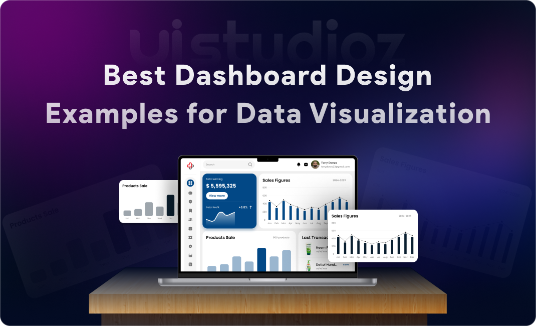
Think about the last time you opened an analytics tool or logged into a SaaS platform. What did you see first? Probably a dashboard—a central hub displaying metrics, charts, and key information at a glance. That’s exactly why exploring the best dashboard design examples can help you understand what truly works.
Dashboards have become the control centre of modern digital products. Whether it’s a marketing analytics tool, a healthcare app, or an enterprise resource planner, dashboards help users make sense of complex data quickly. But here’s the catch: poorly designed dashboards confuse users, bury insights, and hurt business outcomes.
That’s where UI/UX design becomes critical. A well-designed dashboard doesn’t just look good—it guides users, highlights what matters, and turns raw data into actionable insights.
In this blog, we’ll explore:
- What makes dashboard design great
- The latest dashboard design trends in 2026
- Real-world dashboard design examples across SaaS, analytics, admin, finance, healthcare, and mobile
- UI/UX best practices backed by experience
- Step-by-step guidance on how to design a modern dashboard
- Tools and tips to level up your dashboard design skills
Whether you’re a product designer, startup founder, or developer building your first admin panel, this guide will give you practical, proven strategies to create dashboards users actually want to use.
What Makes a Great Dashboard Design?
Before diving into examples, let’s establish the foundation. Great dashboard UI/UX design isn’t about flashy graphics—it’s about clarity, usability, and insight.
1. Clarity Over Complexity
A dashboard should answer user questions in seconds, not minutes. Avoid cluttering the interface with unnecessary widgets. Every element should have a clear purpose.
2. Visual Hierarchy & Layout
Users naturally scan from top-left to bottom-right. Place the most important KPIs (Key Performance Indicators) at the top. Use size, color, and spacing to create a clear visual flow.
3. Real-Time Usability
Modern dashboards often display live data. The UI should update smoothly without confusing the user. Loading states, skeleton screens, and micro-animations help maintain context during data refresh.
4. Consistency in Design
Use a design system with consistent typography, color palettes, button styles, and iconography. This reduces cognitive load and makes the dashboard feel professional and trustworthy.
5. Actionable Insights vs Raw Data
Don’t just show numbers—show what they mean. Use trend indicators (↑ 12% this week), color-coded alerts (red for critical issues), and contextual messages to guide user action.
Pro Tip: At Uistudioz, we’ve helped SaaS companies redesign cluttered dashboards that increased user engagement by over 35%. The secret? Ruthless prioritization of data.
Dashboard Design Trends in 2026
Dashboard design evolves rapidly. Here are the top UI/UX trends shaping dashboards in 2026:
1. Minimal & Clean Interfaces
Less is more. Clean dashboard UI design examples show generous white space, simple layouts, and focused data presentation. Users appreciate breathing room.
2. Dark Mode Dashboards
Dark mode reduces eye strain and looks modern. Many analytics dashboard design examples now offer theme toggles, letting users choose their preferred mode.
3. AI-Powered Data Insights
AI is transforming how dashboards present data. Instead of forcing users to interpret charts, AI summarizes trends (“Sales are up 15% due to campaign X”) and predicts future patterns. Learn more about AI tools for UI/UX designers.
4. Micro-Interactions & Animations
Subtle animations (hover effects, smooth transitions, loading indicators) make dashboards feel alive and responsive. But keep them purposeful—not distracting.
5. Customizable Dashboards
Users want control. Drag-and-drop widgets, collapsible sections, and personalized views let users tailor dashboards to their workflow.
6. Mobile-First Dashboard Design
With remote work on the rise, mobile dashboard UI design inspiration is critical. Responsive dashboard UI design examples ensure data is accessible on any device.
Best Dashboard Design Examples (With UI/UX Insights)
Let’s examine real-world dashboard design ideas for web apps across different industries.
1) SaaS Dashboard Example
Example: Notion Analytics Dashboard
Key Features:
- Clean, card-based layout
- Real-time workspace activity
- Quick-access navigation sidebar
UI/UX Strengths:
- Visual hierarchy: Most important metrics (active users, engagement) placed top-center
- Whitespace: Prevents information overload
- Customization: Users can pin favorite metrics
Why It Works:
Users get immediate value without hunting for data. The minimal dashboard design inspiration here is perfect for daily use.
2) Analytics Dashboard Example
Example: Google Analytics 4 (GA4)
Data Visualization Techniques:
- Line charts for trends
- Pie charts for traffic sources
- Heatmaps for user behavior
Graph & Chart Usage:
GA4 uses color-coded segments and interactive tooltips to let users drill down into specifics without leaving the main view.
Lesson: Good examples of interactive dashboards UI allow users to explore data layers progressively, not all at once.
3) Admin Dashboard Example
Example: WordPress Admin Panel
Navigation & Structure:
- Left sidebar with collapsible menus
- Top bar for quick actions
- Breadcrumb navigation for context
User Control Features:
Admins can manage users, content, and settings from one interface. Dashboard layout design examples for apps often borrow this sidebar + main content structure.
Lesson: Consistency and familiarity reduce learning curves.
4) Finance Dashboard Example
Example: Mint Financial Dashboard
KPI Display:
Large numbers with trend arrows (↑↓) show account balances, spending vs budget, and credit scores at a glance.
Data Clarity:
Color coding (green = good, red = alert) instantly communicates financial health without reading fine print.
Lesson: For critical data (like money or health), visual cues should trigger instant understanding.
5) Healthcare Dashboard Example
Example: Epic MyChart Patient Portal
Accessibility:
High-contrast colors, large fonts, and voice navigation options ensure inclusivity.
Data Prioritization:
Upcoming appointments and test results appear first. Historical data is one click away.
Lesson: Accessibility isn’t optional—it’s essential. Follow WCAG 2.2 standards for inclusive design.
6) Mobile Dashboard Example
Example: Todoist Mobile Dashboard
Responsive Layout:
Stacked cards, thumb-friendly buttons, and swipe gestures make navigation effortless on small screens.
Simplified UI:
Unlike web versions, mobile dashboards hide advanced features behind menus to keep the main screen clean.
Lesson: Mobile dashboard UI design inspiration often means subtracting features, not shrinking them.
Related Resource: Check out our guide on UI/UX design trends in quick commerce apps to see how mobile-first design principles apply across industries.
Key Elements of Effective Dashboard UI Design
Here’s what every modern dashboard UI design in 2026 should include:
1. Data Visualization (Charts, Graphs, Tables)
Choose the right chart type:
- Line charts for trends over time
- Bar charts for comparisons
- Pie charts for proportions (use sparingly)
- Tables for detailed, scannable data
2. Typography & Readability
Use sans-serif fonts (Inter, Roboto) for digital readability. Keep body text at 14–16px. Bold headings create hierarchy.
3. Color Usage & Contrast
Stick to a 3-5 color palette:
- Primary color for brand identity
- Neutral grays for backgrounds
- Accent colors for highlights and alerts
Ensure 4.5:1 contrast ratio for accessibility.
4. Navigation & Filtering
Let users filter by date range, category, or user segment. Sticky headers and breadcrumb trails help users stay oriented.
5. Interactive Components
Hover states, clickable cards, expandable sections, and tooltips add depth without clutter.
Dashboard UI/UX Best Practices
Here are dashboard design best practices for UX based on real client projects:
Keep It Simple and Focused
Ask: What’s the ONE thing users need to know? Design around that.
Prioritize Important Data
Use the F-pattern (users scan horizontally at the top, then vertically down the left). Place critical KPIs accordingly.
Use Consistent Design Systems
Build reusable components. Tools like Figma and Storybook help maintain consistency across screens.
Optimize for Performance
Dashboards with slow load times frustrate users. Lazy-load charts, use skeleton screens, and cache data where possible.
Design for Different User Roles
Admins need control panels. End-users need simplified views. Role-based dashboards improve relevance.
Tools for Designing Dashboard UI
Here are the best tools for dashboard design in 2026:
1. Figma
Industry-standard for collaborative UI/UX design. Check out Figma dashboard design examples in the community library for inspiration.
2. Adobe XD
Great for prototyping interactive dashboards with auto-animate features.
3. Sketch
Popular among Mac users. Excellent plugin ecosystem for dashboard components.
4. Power BI
Microsoft’s tool for building data visualization dashboard examples. Ideal for enterprise analytics.
5. Tableau
Best for complex, real-time data dashboard UI design. Tableau dashboard UI examples are widely used in finance and healthcare.
Internal Resource: Need a custom dashboard? Explore our website design services and mobile app design services.
How to Design a Dashboard UI Step-by-Step
Follow this process to create a modern dashboard UI:
Step 1: Define User Goals
Interview users. What decisions do they need to make? What data helps them?
Step 2: Choose the Right Data
Don’t show all available data—show relevant data. Prioritize metrics tied to user goals.
Step 3: Wireframe the Layout
Sketch low-fidelity layouts. Test different arrangements. Focus on hierarchy before aesthetics.
Step 4: Design UI Components
Build high-fidelity mockups in Figma or Adobe XD. Apply your design system (colors, typography, spacing).
Step 5: Add Interactions
Prototype clickable elements, hover states, and transitions. Show how data updates in real-time.
Step 6: Test and Iterate
Run usability tests with real users. Watch where they get stuck. Iterate based on feedback.
Pro Tip: At Uistudioz, we use a “test early, test often” approach. Small tweaks during testing prevent costly redesigns later.
Common Dashboard Design Mistakes to Avoid
Overloading with Data
More data ≠ better dashboard. Focus on actionable insights.
Poor Visual Hierarchy
If everything is bold and colorful, nothing stands out. Use contrast strategically.
Ignoring Mobile Responsiveness
With 60%+ of web traffic on mobile, skipping responsive design is a fatal mistake.
Using Too Many Colors
Rainbows belong in the sky, not on dashboards. Stick to a limited palette.
Lack of User Focus
Designing for “everyone” means designing for no one. Define your primary user persona and optimize for them.
Why Good Dashboard Design Impacts Business Growth
Great dashboard UX isn’t just aesthetic—it drives measurable business outcomes:
Better Decision-Making: Clear data helps teams act faster and smarter.
Improved User Engagement: Users return to products they enjoy using.
Increased Productivity: Less time hunting for data = more time executing.
Higher Conversion Rates: SaaS products with intuitive dashboards see lower churn.
According to a Forrester study, every dollar invested in UX returns $100 in ROI. That’s a 9,900% return.
Related Reading: Learn how UI/UX design drives business growth.
Conclusion
Dashboard design is both an art and a science. The best UI UX dashboard designs combine aesthetic appeal with functional clarity—they don’t just show data; they help users understand and act on it.
As we’ve explored, great dashboards share common traits:
✔ Clarity over complexity
✔ Strong visual hierarchy
✔ Real-time usability
✔ Consistent design systems
✔ Mobile responsiveness
✔ User-focused insights
Whether you’re building a SaaS product, an analytics platform, or an internal admin tool, investing in thoughtful dashboard UI/UX design pays dividends in user satisfaction, engagement, and business outcomes.
Remember: Your dashboard is often the first thing users see when they log in. Make it count.
Frequently Asked Questions (FAQs)
What are the best dashboard design examples for web applications?
Google Analytics, Notion, Asana, and HubSpot are excellent examples. They balance data density with usability and offer customizable views.
What’s the difference between dashboard UI and data visualization design?
Dashboard UI is the complete interface (navigation, layout, controls). Data visualization refers to charts and graphs within the dashboard.
What tools should beginners use to design dashboards?
Start with Figma (free, collaborative) or Adobe XD. For data-heavy dashboards, explore Power BI or Tableau.
How do I make my dashboard mobile-friendly?
Use responsive grids, prioritize essential data, design for touch (larger buttons), and test on real devices.
What are the best practices for data visualization dashboards?
Choose the right chart type
Use color intentionally
Label axes clearly
Provide interactive tooltips
Optimize for performance
How can I improve dashboard user experience?
Simplify the layout, reduce cognitive load, add filters and search, use consistent design patterns, and gather user feedback regularly.
What are SaaS dashboard UI design best practices?
Focus on onboarding, allow customization, use real-time data, provide contextual help, and design for multiple user roles.
Are there free dashboard UI templates?
Yes! Check Figma Community, UI8, and ThemeForest for free and premium dashboard UI templates.
What are dashboard design trends in 2026?
Dark mode, AI-powered insights, minimal interfaces, micro-interactions, mobile-first design, and personalized dashboards.
How do I choose between Figma, Power BI, and Tableau for dashboard design?
Figma: UI/UX design and prototyping
Power BI: Business intelligence and analytics for Microsoft ecosystems
Tableau: Advanced data visualization and enterprise reporting