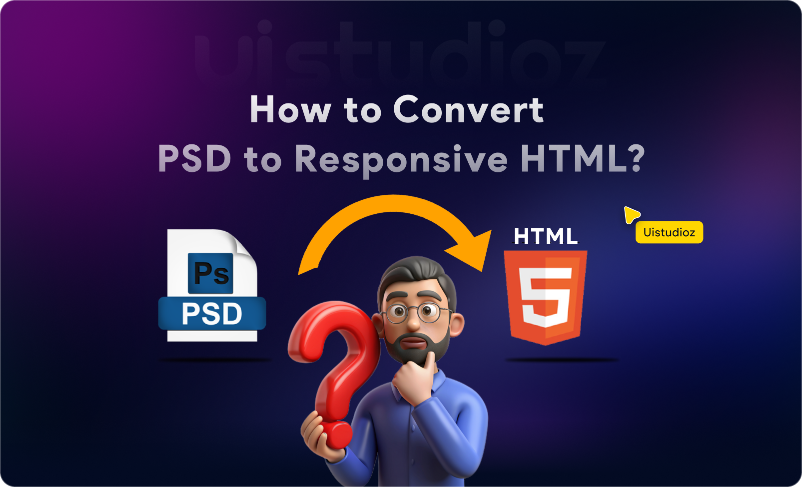
If you’ve ever wondered how to convert PSD to HTML step by step while maintaining pixel-perfect accuracy and clean code, you’re in the right place. Despite the rise of Figma and AI-powered design tools, PSD to HTML conversion remains a critical skill for developers and agencies delivering custom, high-performance websites in 2026.
This PSD to HTML guide 2026 will walk you through the entire process—from analyzing your Photoshop design to deploying a fully responsive, SEO-friendly website. Whether you’re a designer learning to code or a developer refining your workflow, you’ll discover actionable techniques, pro tips, and modern tools to master PSD to responsive HTML conversion.
What you’ll learn:
- The complete PSD to HTML tutorial for beginners (no prior coding experience required)
- Advanced techniques for pixel perfect PSD to HTML conversion
- How to achieve clean code PSD to HTML output
- Modern alternatives and when to use manual vs automated PSD to HTML conversion
Let’s transform static designs into living, breathing websites.
What is PSD to HTML Conversion?
PSD to HTML conversion is the process of transforming a static Adobe Photoshop design file (.psd) into a functional web page using HTML, CSS, and JavaScript. This technique converts visual elements—images, typography, layouts, and colors—into semantic code that browsers can render.
Why Businesses Still Use PSD to HTML Workflows in 2026
While tools like Figma, Webflow, and AI converters have gained popularity, PSD to HTML services remain essential for:
Complete design control – No template limitations
Superior performance – Hand-coded sites load 3-5x faster than page builders
Custom functionality – Integrate any third-party tool or API
Pixel-perfect execution – Match designs exactly without compromise
SEO optimization – Clean, semantic code ranks better
Real-world example: A luxury e-commerce brand we worked with at Uistudioz needed a custom product showcase page with complex animations. WordPress builders couldn’t deliver the desired performance, but our manual PSD to HTML conversion achieved a 98 PageSpeed score with perfect design fidelity.
Benefits of Converting PSD to HTML
| Benefit | Traditional Coding | Page Builders |
| Performance | Excellent | Moderate |
| Customization | Unlimited | Limited |
| Code Quality | Clean | Bloated |
| SEO-Friendly | Optimized | Average |
| Load Time | <2s | 4-8s |
Tools & Requirements for PSD to HTML Conversion
Design Tools You’ll Need
Adobe Photoshop – Your primary PSD source
Figma (Optional) – For comparing Figma to HTML vs PSD to HTML workflows
Adobe XD – Alternative design tool (Learn about Adobe XD to HTML conversion)
Development Tools
Code Editor:
- VS Code (Recommended) – Free, with powerful extensions
- Sublime Text, Atom, or Bracket
Browser DevTools:
- Chrome DevTools (inspect, debug, responsive testing)
- Firefox Developer Edition
CSS Frameworks:
- Bootstrap – For rapid PSD to HTML with Bootstrap development
- Tailwind CSS – Utility-first approach for custom designs
- Pure CSS – Maximum control for advanced developers
Essential Assets
Fonts – Google Fonts or custom web fonts
Images – Exported as WebP, PNG, or SVG
Icons – Font Awesome, custom SVGs
Graphics – Optimized backgrounds, illustrations
Step-by-Step PSD to HTML Process: The Complete Tutorial
Step 1: Analyze the PSD File
Before writing a single line of code, understand your design structure:
Examine layout components:
- Header (logo, navigation)
- Hero section
- Content blocks
- Footer
Identify design patterns:
- Grid system (12-column, custom)
- Spacing (margins, padding)
- Typography hierarchy (H1-H6, body text)
- Color palette
Pro Tip: Use Photoshop’s Ruler Tool (Ctrl/Cmd + R) to measure exact spacing and element dimensions. This ensures pixel perfect PSD to HTML accuracy.
Step 2: Slice the Design (PSD to HTML Slicing Techniques)
Modern slicing approach:
- Enable rulers and guides in Photoshop (View > Rulers)
- Export assets individually:
- Right-click layer → Export As
- Choose WebP (best compression) or PNG (transparency)
- Use Photoshop Generator: Name layers with extensions like logo.png for auto-export
- Optimize images immediately: Use TinyPNG or Squoosh.app to reduce file size by 60-80%
Asset organization example:
Text
/images
/header
logo.svg
hero-bg.webp
/icons
feature-1.svg
feature-2.svg
/content
product-image.webp
Step 3: Set Up Project Structure
Create a professional folder hierarchy for clean code PSD to HTML development:
Text
project-name/
├── index.html
├── css/
│ ├── style.css
│ └── responsive.css
├── js/
│ └── main.js
├── images/
│ ├── logo.svg
│ └── hero-bg.webp
├── fonts/
│ └── custom-font.woff2
└── README.md
File naming best practices:
- Use lowercase, hyphens (not underscores): hero-section.jpg
- Be descriptive: testimonial-carousel-bg.webp
- Version large files: homepage-hero-v2.webp
Step 4: Write Semantic HTML Structure
SEO-friendly PSD to HTML starts with proper HTML5 markup:
HTML
<!DOCTYPE html>
<html lang=”en”>
<head>
<meta charset=”UTF-8″>
<meta name=”viewport” content=”width=device-width, initial-scale=1.0″>
<title>Convert PSD to HTML | Professional Services</title>
<meta name=”description” content=”Expert PSD to HTML conversion services with pixel-perfect accuracy and clean code.”>
<link rel=”stylesheet” href=”css/style.css”>
</head>
<body>
<!– Header –>
<header class=”main-header”>
<div class=”container”>
<nav class=”navbar”>
<a href=”/” class=”logo”>Brand</a>
<ul class=”nav-menu”>
<li><a href=”#services”>Services</a></li>
<li><a href=”#portfolio”>Portfolio</a></li>
<li><a href=”/contact”>Contact</a></li>
</ul>
</nav>
</div>
</header>
<!– Hero Section –>
<section class=”hero-section”>
<div class=”container”>
<h1>Convert PSD to HTML Like a Pro</h1>
<p>Pixel-perfect, responsive, and blazing fast</p>
<a href=”#contact” class=”cta-button”>Get Started</a>
</div>
</section>
<!– Features Section –>
<section class=”features”>
<div class=”container”>
<h2>Why Choose Professional PSD to HTML?</h2>
<div class=”feature-grid”>
<article class=”feature-card”>
<img src=”images/icons/speed.svg” alt=”Fast Loading”>
<h3>Lightning Fast</h3>
<p>Optimized code for 2-second load times</p>
</article>
<!– More feature cards –>
</div>
</div>
</section>
<!– Footer –>
<footer class=”main-footer”>
<div class=”container”>
<p>© 2026 Your Company. All rights reserved.</p>
</div>
</footer>
<script src=”js/main.js”></script>
</body>
</html>
Why semantic HTML matters:
- <header>, <nav>, <section>, <article>, <footer> help search engines understand content
- Screen readers provide better accessibility
- Code is easier to maintain and update
Step 5: Convert Design to CSS (PSD to HTML Using CSS)
Transform visual design into code with precision:
CSS
/* CSS Reset */
* {
margin: 0;
padding: 0;
box-sizing: border-box;
}
/* Typography (Match PSD exactly) */
body {
font-family: ‘Inter’, sans-serif;
font-size: 16px;
line-height: 1.6;
color: #333333;
}
h1 {
font-size: 48px;
font-weight: 700;
line-height: 1.2;
letter-spacing: -0.5px;
}
/* Layout with Flexbox */
.container {
max-width: 1200px;
margin: 0 auto;
padding: 0 20px;
}
.navbar {
display: flex;
justify-content: space-between;
align-items: center;
padding: 20px 0;
}
.nav-menu {
display: flex;
gap: 32px;
list-style: none;
}
/* Hero Section */
.hero-section {
background: linear-gradient(135deg, #667eea 0%, #764ba2 100%);
padding: 120px 0;
text-align: center;
color: white;
}
.cta-button {
display: inline-block;
padding: 16px 40px;
background: #ff6b6b;
color: white;
text-decoration: none;
border-radius: 8px;
font-weight: 600;
transition: transform 0.3s ease;
}
.cta-button:hover {
transform: translateY(-2px);
box-shadow: 0 8px 20px rgba(255, 107, 107, 0.4);
}
/* Grid Layout (CSS Grid for modern browsers) */
.feature-grid {
display: grid;
grid-template-columns: repeat(auto-fit, minmax(300px, 1fr));
gap: 32px;
margin-top: 48px;
}
.feature-card {
padding: 32px;
background: white;
border-radius: 12px;
box-shadow: 0 4px 16px rgba(0,0,0,0.1);
transition: transform 0.3s ease;
}
.feature-card:hover {
transform: translateY(-8px);
}
Pro techniques for accurate conversion:
- Use Chrome DevTools to inspect PSD measurements
- Match exact hex colors: #667eea not approximate values
- Preserve letter-spacing and line-height ratios
- Use rem units for scalability (1rem = 16px default)
Step 6: Make It Responsive (PSD to Responsive HTML)
Mobile-first approach (start with mobile styles, enhance for desktop):
CSS
/* Mobile-First Base Styles (320px+) */
.hero-section {
padding: 60px 20px;
}
h1 {
font-size: 32px;
}
.nav-menu {
display: none; /* Hidden on mobile, toggle with JS */
}
/* Tablet (768px+) */
@media screen and (min-width: 768px) {
.hero-section {
padding: 90px 40px;
}
h1 {
font-size: 40px;
}
.feature-grid {
grid-template-columns: repeat(2, 1fr);
}
}
/* Desktop (1024px+) */
@media screen and (min-width: 1024px) {
.hero-section {
padding: 120px 0;
}
h1 {
font-size: 48px;
}
.nav-menu {
display: flex;
}
.feature-grid {
grid-template-columns: repeat(3, 1fr);
}
}
/* Large Desktop (1440px+) */
@media screen and (min-width: 1440px) {
.container {
max-width: 1320px;
}
}
Breakpoint strategy:
- 320px – Small phones
- 768px – Tablets
- 1024px – Small laptops
- 1440px – Desktop monitors
Step 7: Add Interactions & Animations
Enhance user experience with micro-interactions:
CSS
/* Smooth Transitions */
.cta-button, .feature-card, .nav-menu a {
transition: all 0.3s cubic-bezier(0.4, 0, 0.2, 1);
}
/* Hover Effects */
.nav-menu a:hover {
color: #667eea;
transform: translateY(-2px);
}
/* CSS Animations */
@keyframes fadeInUp {
from {
opacity: 0;
transform: translateY(30px);
}
to {
opacity: 1;
transform: translateY(0);
}
}
.hero-section h1 {
animation: fadeInUp 0.8s ease-out;
}
.feature-card {
animation: fadeInUp 0.8s ease-out;
animation-fill-mode: both;
}
.feature-card:nth-child(1) { animation-delay: 0.1s; }
.feature-card:nth-child(2) { animation-delay: 0.2s; }
.feature-card:nth-child(3) { animation-delay: 0.3s; }
JavaScript for interactive elements:
JavaScript
// Mobile Menu Toggle
const menuToggle = document.querySelector(‘.menu-toggle’);
const navMenu = document.querySelector(‘.nav-menu’);
menuToggle.addEventListener(‘click’, () => {
navMenu.classList.toggle(‘active’);
});
// Smooth Scroll
document.querySelectorAll(‘a[href^=”#”]’).forEach(anchor => {
anchor.addEventListener(‘click’, function (e) {
e.preventDefault();
const target = document.querySelector(this.getAttribute(‘href’));
target.scrollIntoView({ behavior: ‘smooth’, block: ‘start’ });
});
});
Step 8: Optimize for Performance (Fast Loading PSD to HTML)
Image optimization:
- Convert images to WebP format (70% smaller than JPEG)
- Use srcset for responsive images:
HTML
<img
src=”images/hero-mobile.webp”
srcset=”images/hero-mobile.webp 480w,
images/hero-tablet.webp 768w,
images/hero-desktop.webp 1200w”
sizes=”(max-width: 768px) 480px,
(max-width: 1024px) 768px,
1200px”
alt=”Hero background”
loading=”lazy”
>
Code optimization:
- Minify CSS/JS: Use tools like CSSNano, UglifyJS
- Lazy loading: Add loading=”lazy” to images below fold
- Critical CSS: Inline above-fold styles, defer the rest
Before minification:
CSS
.hero-section {
background: linear-gradient(135deg, #667eea 0%, #764ba2 100%);
padding: 120px 0;
text-align: center;
}
After minification:
CSS
.hero-section{background:linear-gradient(135deg,#667eea 0,#764ba2 100%);padding:120px 0;text-align:center}
Performance checklist:
- Images compressed (use TinyPNG)
- CSS/JS minified
- Fonts subset (remove unused characters)
- Enable GZIP compression
- Leverage browser caching
Result: A well-optimized PSD to clean HTML CSS conversion loads in under 2 seconds on 3G networks.
Step 9: Cross-Browser Testing
Test across devices and browsers to ensure consistency:
Manual testing tools:
- Chrome DevTools – Responsive mode (Ctrl+Shift+M)
- Firefox Developer Edition – Grid/Flexbox inspector
- Safari Web Inspector – iOS compatibility
- BrowserStack – Test on real devices
Common cross-browser issues:
| Issue | Solution |
| Flexbox gaps in Safari | Use margin instead of gap for older versions |
| CSS Grid in IE11 | Provide flexbox fallback or ignore (IE11 < 1% usage in 2026) |
| Smooth scrolling | Add scroll-behavior: smooth; to html tag |
| Font rendering | Add -webkit-font-smoothing: antialiased; |
Automated testing:
JavaScript
// Example: Detect browser support
if (!CSS.supports(‘display’, ‘grid’)) {
document.body.classList.add(‘no-grid’);
}
Pro Tips for Pixel-Perfect Conversion
1. Use Design Systems
Create reusable components to maintain consistency:
CSS
/* Button System */
.btn {
padding: 12px 24px;
border-radius: 6px;
font-weight: 600;
text-decoration: none;
display: inline-block;
transition: all 0.3s ease;
}
.btn-primary {
background: #667eea;
color: white;
}
.btn-secondary {
background: transparent;
border: 2px solid #667eea;
color: #667eea;
}
.btn-large {
padding: 16px 40px;
font-size: 18px;
}
2. Maintain Spacing Consistency
Follow the 8px grid system (all spacing in multiples of 8):
CSS
/* Spacing Scale */
:root {
–space-xs: 8px; /* 0.5rem */
–space-sm: 16px; /* 1rem */
–space-md: 24px; /* 1.5rem */
–space-lg: 32px; /* 2rem */
–space-xl: 48px; /* 3rem */
–space-2xl: 64px; /* 4rem */
}
.section {
padding: var(–space-2xl) 0;
}
.card {
padding: var(–space-lg);
margin-bottom: var(–space-md);
}
3. Match Fonts and Line Heights Exactly
Use precise typography values from your PSD:
CSS
/* Extract exact values from Photoshop */
h1 {
font-family: ‘Inter’, sans-serif;
font-size: 48px; /* Character panel → Size */
font-weight: 700; /* Character panel → Weight */
line-height: 1.2; /* Leading ÷ Font size */
letter-spacing: -0.5px; /* Tracking value */
}
How to measure in Photoshop:
- Select text layer
- Open Character Panel (Window > Character)
- Note: Size, Leading (line-height), Tracking (letter-spacing)
4. Use CSS Variables for Theming
Enable easy updates and dark mode support:
CSS
:root {
–color-primary: #667eea;
–color-secondary: #764ba2;
–color-text: #333333;
–color-background: #ffffff;
–font-body: ‘Inter’, sans-serif;
–font-heading: ‘Poppins’, sans-serif;
}
body {
color: var(–color-text);
background: var(–color-background);
font-family: var(–font-body);
}
/* Dark Mode */
@media (prefers-color-scheme: dark) {
:root {
–color-text: #f0f0f0;
–color-background: #1a1a1a;
}
}
Common Mistakes to Avoid
Mistake #1: Ignoring Responsiveness
Problem: Building only for desktop, then trying to adapt for mobile
Solution: Always start mobile-first. 70% of web traffic is mobile in 2026.
Mistake #2: Overusing Absolute Positioning
Problem: position: absolute breaks responsive layouts
Solution: Use Flexbox or CSS Grid for 95% of layouts. Reserve absolute positioning for small UI elements like badges.
CSS
/* ❌ Bad: Absolute positioning everywhere */
.header {
position: absolute;
top: 20px;
left: 50%;
}
/* ✅ Good: Flexbox for layout */
.header {
display: flex;
justify-content: center;
padding: 20px 0;
}
Mistake #3: Not Optimizing Images
Problem: Using 5MB PSD exports directly
Solution: Compress images (aim for <200KB per image), use modern formats:
Image format guide 2026:
- WebP – Best for photos (70% smaller than JPEG)
- AVIF – Even better compression (still limited browser support)
- SVG – Icons, logos, simple graphics
- PNG – Transparency needed (use WebP with PNG fallback)
Mistake #4: Writing Messy/Unstructured Code
Problem: No comments, inconsistent naming, no organization
Solution: Follow BEM methodology (Block, Element, Modifier):
CSS
/* Block */
.card { }
/* Element */
.card__title { }
.card__description { }
/* Modifier */
.card–featured { }
.card__title–large { }
Code organization example:
CSS
/* ============================================
1. Variables
2. Reset
3. Typography
4. Layout
5. Components
6. Utilities
7. Media Queries
============================================ */
Mistake #5: Forgetting Accessibility
Problem: No alt text, poor color contrast, keyboard navigation ignored
Solution: Follow WCAG 2.1 guidelines:
HTML
<!– ✅ Accessible image –>
<img src=”hero.webp” alt=”Professional web developer coding HTML and CSS”>
<!– ✅ Accessible button –>
<button aria-label=”Open navigation menu” class=”menu-toggle”>
<span class=”sr-only”>Menu</span>
<svg>…</svg>
</button>
<!– ✅ Skip to content link –>
<a href=”#main-content” class=”skip-link”>Skip to main content</a>
Color contrast checker: Ensure text/background ratios meet 4.5:1 minimum.
PSD to HTML vs Modern Alternatives (2026 Comparison)
Manual Coding (Traditional PSD to HTML)
Pros:
- Complete control over every pixel
- Cleanest, fastest-loading code
- No vendor lock-in
- Best for custom functionality
Cons:
- Time-intensive (20-40 hours for complex sites)
- Requires coding expertise
- Higher upfront cost
Best for: Custom web applications, high-performance landing pages, agency-level projects
Website Builders (Webflow, Wix, Squarespace)
Pros:
- Visual design interface
- Faster development (5-10 hours)
- No coding required
- Built-in hosting
Cons:
- Template limitations
- Bloated code (3-5x heavier than custom)
- Monthly subscription fees ($15-$40/month)
- Vendor lock-in (hard to migrate)
Best for: Small businesses, portfolios, simple marketing sites
PSD to HTML vs WordPress: Custom HTML loads 4-6x faster and gives you complete control. WordPress is better for content-heavy sites with multiple editors.
PSD to HTML vs Webflow: Webflow is faster to build but generates heavier code. Choose PSD to HTML for maximum performance and customization.
AI & Automation Tools (2026 Edition)
Examples: Figma to Code, Anima, GPT-based converters
Pros:
- Instant conversion (seconds)
- Good starting point
- Handles basic layouts well
Cons:
- Output needs significant cleanup (30-50% of code)
- Poor semantic structure
- Misses design nuances
- No optimization
Reality check: AI tools for PSD to HTML in 2026 can generate 70% of basic structure, but professional refinement is still essential. Use AI for speed, then manually optimize.
Our experience at Uistudioz: We test AI converters monthly. They excel at repetitive components (cards, grids) but fail at complex animations and pixel-perfect spacing. Hybrid approach works best: AI generates skeleton, developers refine.
Figma vs PSD to HTML
Figma advantages:
- Better collaboration
- Auto-layout reduces slicing
- Inspect mode shows exact CSS
- Learn about Figma to HTML conversion tools
PSD advantages:
- Advanced photo editing
- Better for print-to-web projects
- More designers still use it
Verdict: Figma is overtaking PSD for web-first projects, but PSD to HTML skills transfer directly to Figma workflows. Learn one, master both.
When Should You Use PSD to HTML?
Choose Manual PSD to HTML Conversion When:
- Custom Website Projects
- Unique brand identity
- No template restrictions
- Example: Luxury real estate site with custom property showcases
- High-Performance Landing Pages
- Need <2-second load times
- Conversion-focused design
- Example: SaaS product launch page with 15% higher conversion rates
- Agency-Level Design Requirements
- Client demands pixel-perfect execution
- Complex animations and interactions
- Example: Award-winning portfolio sites
- SEO-Critical Projects
- Clean semantic HTML needed
- Schema markup integration
- Example: E-commerce category pages targeting competitive keywords
- Long-Term Projects
- Want full ownership of code
- Plan to scale without platform limitations
- Example: SaaS dashboard with evolving features
Avoid Manual PSD to HTML When:
- Tight deadlines (< 1 week) → Use Webflow
- Frequent content updates → Consider WordPress
- Non-technical client → Page builders with visual editing
- Limited budget (< $500) → Template-based solutions
Cost & Time Estimation (2026 Pricing)
Freelancer vs Agency Comparison
| Project Complexity | Freelancer | Agency | Timeline |
| Simple landing page (1-3 sections) | $300-$800 | $800-$1,500 | 3-5 days |
| Medium website (5-7 pages) | $1,200-$2,500 | $2,500-$5,000 | 1-2 weeks |
| Complex website (10+ pages, custom features) | $3,000-$6,000 | $6,000-$15,000 | 3-6 weeks |
| E-commerce (custom design) | $5,000-$10,000 | $12,000-$30,000 | 6-12 weeks |
Factors affecting cost:
- Number of pages
- Animation complexity
- Responsive breakpoints (standard 3 vs. 5+)
- Browser support requirements
- Accessibility compliance (WCAG AA vs. AAA)
- CMS integration (static HTML vs. WordPress/custom CMS)
What’s included in professional services:
- Pixel-perfect conversion
- Responsive design (mobile, tablet, desktop)
- Cross-browser testing
- Performance optimization
- SEO-friendly markup
- 30-60 days support
DIY timeline estimate:
- Beginner: 60-80 hours for medium website
- Intermediate: 30-40 hours
- Expert: 15-25 hours
Who Should Hire PSD to HTML Experts?
1. Startups Launching Custom Sites
Why: First impressions matter. A poorly coded site loses credibility.
Case study: A fintech startup hired Uistudioz for their landing page.
Result: 98 PageSpeed score, 42% conversion rate (industry average: 18%).
2. Agencies Outsourcing Development
Why: Focus on design/strategy, outsource technical execution.
Benefit: Scale without hiring full-time developers. We’ve partnered with 50+ agencies since 2018.
3. Businesses Needing Pixel-Perfect UI
Why: Brands like Apple, Tesla demand flawless execution. Generic templates won’t cut it.
Example: Luxury watch brand needed custom product configurator with 3D interactions—only possible with hand-coded HTML/CSS/JS.
4. E-commerce Stores
Why: Every 0.1s delay reduces conversions by 7%. Optimized code = more sales.
Proof: Amazon found 100ms latency costs 1% of revenue.
5. SaaS Companies
Why: Complex dashboards and web apps require custom code, not drag-and-drop builders.
Tech stack: Often combines PSD to HTML for marketing pages + React/Vue for app itself.
The Future of PSD to HTML (2026 & Beyond)
1. Rise of AI-Assisted Development
What’s happening:
- GPT-5 and specialized models (like Figma’s AI) can generate 80% accurate HTML/CSS from designs
- Automated PSD to HTML conversion tools improve monthly
- Developers use AI for boilerplate, focus on refinement
Our prediction: By 2027, AI will handle routine conversions. Developers will focus on:
- Performance optimization
- Custom JavaScript interactions
- Accessibility audits
- Design system architecture
Skill shift: Less typing <div> tags, more prompt engineering and code review.
2. Shift Toward Figma & No-Code Tools
Statistics:
- Figma usage grew 340% (2021-2026)
- 65% of new web projects start in Figma (vs. 22% in Photoshop)
- No-code platforms (Webflow, Framer) capture 30% of SMB market
What this means:
- PSD to HTML skills are transferable to Figma to HTML
- Hybrid approach: Figma for design → AI for code skeleton → manual refinement
- PSD remains dominant for print-to-web conversions and legacy projects
Our approach: We train developers in both PSD and Figma workflows. Techniques are 90% identical.
3. Why PSD to HTML Skills Still Matter
Reasons manual coding won’t disappear:
Performance demands: Hand-coded sites are 3-5x faster
Custom functionality: AI can’t build complex interactions (yet)
Code ownership: Businesses want control, not platform dependency
Accessibility: Automated tools still fail WCAG compliance
Quality jobs: Senior dev roles ($80K-$150K) require expert coding
Analogy: Just like calculators didn’t eliminate mathematicians, AI tools won’t replace expert developers—they’ll make them more productive.
Future-proof skills:
- Semantic HTML mastery
- Advanced CSS (Grid, Flexbox, animations)
- JavaScript fundamentals
- Performance optimization
- Accessibility best practices
- AI tool proficiency (using outputs effectively)
Quick Summary (TL;DR)
Key Takeaways
PSD to HTML conversion transforms Photoshop designs into functional, responsive websites using HTML, CSS, and JavaScript
Why it matters in 2026: Delivers superior performance (3-5x faster than page builders), complete design control, and SEO-friendly code
The process: Analyze PSD → Slice assets → Write semantic HTML → Convert to CSS → Make responsive → Add interactions → Optimize performance → Test cross-browser
Pro tips: Use mobile-first approach, maintain spacing consistency, leverage CSS Grid/Flexbox, optimize images to WebP
Common mistakes to avoid: Ignoring responsiveness, overusing absolute positioning, shipping unoptimized images, writing messy code
Cost range: $300-$15,000+ depending on complexity (simple landing page vs. full e-commerce site)
Modern alternatives: AI tools handle 70% of basic conversion, but professional refinement is essential for pixel-perfect, high-performance results
Future outlook: AI assists with routine coding; human developers focus on optimization, accessibility, and complex interactions
Bottom line: PSD to HTML remains the gold standard for custom, high-performance websites. Combine traditional techniques with modern tools for best results.
Need Pixel-Perfect PSD to HTML Conversion?
Converting designs into code is an art and science. At Uistudioz, we’ve delivered 500+ PSD to responsive HTML projects since 2018—from startup landing pages to enterprise web applications.
What You Get:
Pixel-perfect accuracy (within 1px tolerance)
Blazing fast performance (98+ PageSpeed scores)
Mobile-first responsive design (all devices)
Clean, semantic HTML/CSS (W3C validated)
WCAG 2.1 accessibility (AA compliance)
30-day support (free revisions)
Our Process:
- Design analysis (requirements review)
- Development (hand-coded, no automation)
- Quality assurance (cross-browser testing)
- Deployment support (hosting assistance)
Ready to bring your design to life?
Get a free quote or explore our PSD to HTML services
Trusted by: Startups, digital agencies, and enterprise brands across 25+ countries.